Flows and conversational bot performance dashboard
The flows and conversational bot performance dashboard helps you understand the performance of your automated experiences including flows, flow modules, and conversational bots. You can compare key metrics such as flows started, average flow duration, or bot intent outcome over time. You can filter for specific bots or flows, and save reports to share across your organization.
Contents
Enable access to the dashboard
Ensure users are assigned the appropriate security profile permissions:
-
Access metrics - Access permission or the Dashboard - Access permission. For information about the difference in behavior, see Assign permissions to view dashboards and reports in Amazon Connect.
-
Flows - View, Flow modules - View, and Bot - View permissions: These permissions are required to see data in your dashboard.
Note
You must have the Flows - View permission to see the dashboard.
What do "dropped" and "prior dropped" mean?
The following terms are used in this topic:
-
Dropped: The count of flows that started running within the specified start and end time, and then ended with a contact dropping from the flow before the flow reached a terminal block. For example, a block that is intended to end the contact.
-
Prior dropped: The count of flows in the time range being "compared to" that started running, and then ended with a contact dropping from the flow before the flow reached a terminal block. The time range selected from the Compare to dropdown must be a date in the past compared to your time range.
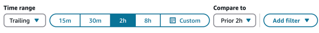
Examples of "Time range" and "Compare to" configurations
Following are a few use cases that help explain how to configure the Time range and Compare to settings.
-
Use case 1: I want to get all the flows dropped in the last 2 hours and compare that to the flows dropped in the last 2 hours prior to the 2 hours selected time range.
Configure the dashboard as follows:
-
Time range = Trailing
-
Time = 2h
-
Compare to = Prior 2h
-
-
Use case 2: I want to get all the flows dropped in the last 2 hours and compare that to the flows dropped yesterday from 00:00:00 to 23:59:59.
Configure the dashboard as follows:
-
Time range = Trailing
-
Time = 2h
-
Compare to = Prior day

-
-
Use case 3: I want to get all the flows dropped in the last 24 hours and compare that to the flows dropped on the same day last week.
Configure the dashboard as follows:
-
Time range = Trailing
-
Time = Custom 24h
-
Compare to = Prior week same day

-
-
Use case 4: I want to get all the flows dropped since 12 am today and compare that to all the flows dropped last week.
Configure the dashboard as follows:
-
Time range = Trailing
-
Time = Custom: Today (since 12am)
-
Compare to = Prior week

-
Performance overview chart
The Performance overview chart provides aggregated metrics based on your filters. Each metric within the charts is compared to your "compare to" benchmark time range filter. For example, flows started during your time range selection was 200,000 which is down 15% compared to your benchmark number of flows started, 235,000. The percentages are rounded up or down. The colors that appear for the dropped in flow metric indicate negative (red) compared to your benchmark.
The following image shows an example of this chart.

The following metrics are displayed on this chart:
-
Flows started: The count of flows that started running within the specified start time and end time.
-
Transferred from flow to queue or agent: The count of flows that started running within the specified start time and end time and ended with a contact transferring from the flow to a queue or agent.
-
Dropped in flow: The count of flows that started running within the specified start time and end time and ended with a contact dropping from the flow before the flow reached a terminal block.
-
Disconnected in flow: The count of flows that started running within the specified start time and end time and ended with a contact reaching a disconnect terminal block
-
Avg duration – transferred to queue: The average flow duration for the specified start time and end time of selected flows where the flow outcome is transferred to queue.
-
Avg duration – disconnected: The average flow duration for the specified start time and end time of selected flows where the flow outcome is disconnected participant.
Comparison to prior period charts
The Top flows by dropped in flow rate and Top flows transferred to queue or agent rate charts display the current period metric and the "Compare to" period metric for the top ten flows sorted (from highest to lowest) by the current period metric. These charts allow you to identify the flows contributing most to overall dropped or transferred contacts.
To see all data, choose the More icon in the top right of the chart, and then choose Expand. The following image shows the Top flows by dropped in flow rate. An arrow points to the location of the More icon.

Failed bot intents movers and shakers
The Failed bot intents movers and shakers chart shows you the bot intents with the highest percent change in failed rate compared to your benchmark time range. For example, if an intent has a failed rate of 10% in the current period and 5% in the previous period, the intent will have a percent change of 100%.
The following image shows an example of this chart.

The following metrics are displayed on this chart:
-
Change %: (Bot intent failed rate % – Prior bot intent failed rate %) / (Prior bot intent failed rate %). This number is rounded. The chart is sorted by highest absolute Change %.
-
Bot intent failed rate: Bot intent failed rate during the specified current time range.
-
Prior bot intent failed rate: Bot intent failed rate during the specified benchmark time range.
-
Bot intents completed: Count of bot intent triggers completed in the specified current time range.
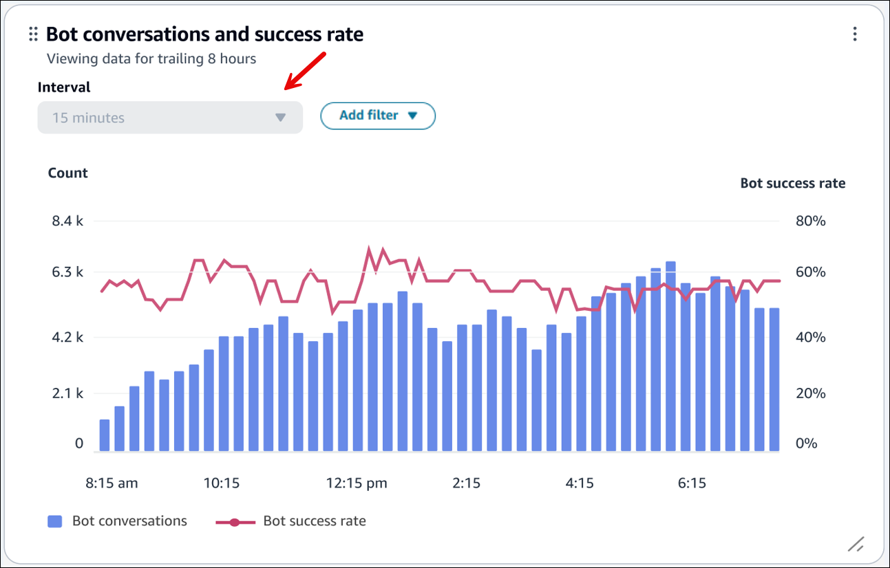
Bot conversations and success rate over time
The Bot conversations and success rate over time trend is a time-series chart that displays the count of bot conversations (blue bars) and the bot conversation success rate (red line) over a given time period broken down by intervals (15min, daily, weekly, monthly).
To configure different time range intervals, choose Interval, as shown in the following image.
Bot conversations overview table
The Bot conversations overview table displays a snapshot of bot conversation metrics aggregated over the selected time range. The following image shows an example of this table.

The following metrics are displayed on this table:
-
Bot conversation: The count of bot conversations that started within the specified time range.
-
Bot success rate: The percentage of successful conversations / total bot conversations. The completion of the final intent in the conversation is categorized as a success.
-
Bot failed rate: The percentage of failed conversations / total bot conversations. The failure to fulfill final intent is categorized as failed.
-
Bot dropped rate: The percentage of dropped conversations / total bot conversations. Drops are categorized when the customer doesn't respond before the conversation is categorized as a success or failed (for example, they are disconnected unexpectedly from the interaction).
-
Avg turns in bot: The average number of turns (that is, a single request from the contact to the bot) for bot conversations that started within the specified time range.
-
Avg bot conversation duration: The average duration for bot conversations that started within the specified time range.
Bot intent overview table
The Bot intent overview table displays a snapshot of bot intent metrics table aggregated over the selected time range. The following image shows an example of this table.

The following metrics are displayed on this table:
-
Bot intents completed: The count of intent triggers that ended within the specified time range.
-
Bot conversation outcome rate: The percentage of bot intent triggers that ended within the specified time range broken down by mutually exclusive and exhaustive list of bot intent outcomes.
-
Intent success rate: The number of times the intent was successful / the number of times the intent was invoked. Success is defined as the bot successfully fulfilling and completing the intent.
-
Intent failed rate: The number of times the intent was failed / the number of times the intent was invoked. Failed is defined as either the user declined the confirmation prompt or the bot switches to the Fallback Intent before completion.
-
Intent dropped rate: The number of times the intent was dropped / the number of times the intent was invoked. Dropped is defined as the user respond before the intent is categorized as a success or failed (for example, they are disconnected unexpectedly from the interaction).
-
Intent switched rate: The number of times the intent was switched / the number of times the intent was invoked. Switched intents occur when the bot recognizes a different intent and switches to that intent instead, before the original intent is categorized as a success or failed.
Flow outcomes over time comparison chart
The Flow outcomes over time comparison chart is a time-series chart that displays the breakdown of Flow outcome rate metrics for a single flow or multiple flows over a given time period and broken down by intervals (15min, daily, weekly, monthly).
You can configure different time range intervals by using the "Interval" button directly in the widget. The intervals that you can select depend on the page-level time range filter. For example:
-
If you have a "Today" time range filter at the top of your dashboard, you can only see an interval of 15min for the last 24 hours.
-
If you have a "Day" time range filter at the top of your dashboard, you can see a trailing 8 day interval trend, or a 15min interval trend for the trailing 24 hours.

Flow durations over time comparison chart
The Flow durations over time comparison chart is a time-series chart that displays the breakdown of Flow duration metrics for a single flow or multiple flows over a given time period and broken down by intervals (15min, daily, weekly, monthly).
You can configure different time range intervals by using the "Interval" button directly in the widget. The intervals that you select depend on the page-level time range filter.
For example:
-
If you have a "Today" time range filter at the top of your dashboard, you can only see an interval of 15min for the last 24 hours.
-
If you have a "Day" time range filter at the top of your dashboard, you can see a trailing 8 day interval trend, or a 15min interval trend for the trailing 24 hours.

Flows and Flow modules overview tables
The Flows and Flow modules overview tables display a snapshot of metrics aggregated over the selected time range. The following image shows an example of the Flows overview table.

The following image shows an example of the Flow modules overview table.

The following metrics are displayed on these tables:
-
Flow / flow module starts: The count of flows that started execution within the specified start time and end time. For a given start and end time it will show the count of those flows whose start time is between the start and end interval specified.
-
Flow outcomes: The count of flows that started execution within the specified start time and end time and ended with a specified mutually exclusive and exhaustive flow outcome.
-
Avg Flow Durations by outcome: The average flow duration for the specified start time and end time with a specified mutually exclusive and exhaustive flow outcome.
Dashboard functionality limitations
The following limitations apply to the Flows performance dashboard:
-
Tag-based access controls are not currently supported by the dashboard. You can restrict access through the Dashboard permissions pertaining to a security profile.
-
No support for metrics on flows that are type Customer hold and Agent hold. For customer hold metrics, see Metric definitions in Amazon Connect.
