Visualize historical queue data in Amazon Connect
You can visualize historical queue data using time series graphs to help identify patterns, trends, and outliers such as Service Level, Contacts Queued, and Average Handle Time.
To view queue data
-
On the Real-time Metrics page, display the Queues table.
-
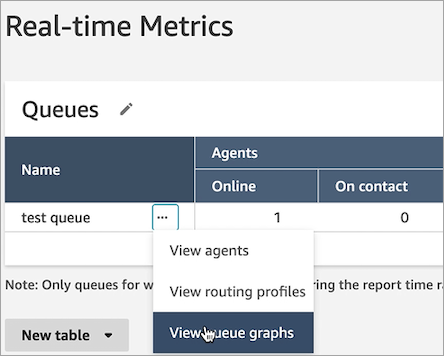
Select View queue graphs from the dropdown menu. The following image shows the dropdown menu for a queue named test queue.

-
After you select View queue graphs, you are directed to the queue visualization dashboard.
-
The Queue dashboard automatically refreshes every 15 minutes. You can:
-
Configure a time range of up to 24 hours.
-
Select the channel of your choice.
-
Customize the service level thresholds.
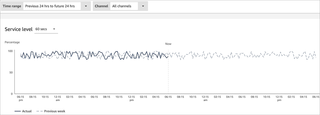
The following image shows an example Queue dashboard. It displays a graph of service level data for the queue. Time range is set to Previous 24 hours to future 24 hours. Channel is set to All channels. Service level is set to 60 seconds.

-