Interacting with Amazon QuickSight dashboards
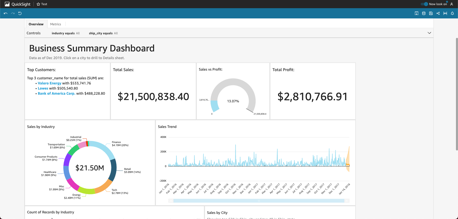
To access a dashboard that you've been invited to share, follow the instructions in the invitation email. You can also access a dashboard if it's embedded into an application or website that you already have access to. When you open the dashboard, the screen should look something like the following example.
To fit the dashboard to your screen, open the View menu at upper right and select Fit to window.
Depending on how the dashboard is configured, you can find all or some of the following elements:
The menu bar – This displays the name of the dashboard. Also, the menu bar shows what you can do with the dashboard, including Undo, Redo, and Reset, on the left. As you interact with the dashboard, you can use these as tools to help you explore, knowing that you can change your view without losing anything. On the right, you can find options to Print the dashboard, work with Data, choose a different AWS Region, and open your User Profile. The user profile menu has options so you can choose the language that Amazon QuickSight displays. It also has links to the Amazon QuickSight Community and the online documentation (Help).
-
The dashboard sheets – If your dashboard has multiple sheets, these display as tabs across the top of the dashboard.
-
The Filter menu – This option displays to the left of the dashboard, if the dashboard publisher allows filtering.
-
The Controls palette – If your dashboard includes controls, you can use them to choose the options (parameters) that you want to apply to your dashboard. Sometimes a control value is selected for you, and sometimes it's set to ALL.
-
The dashboard title – If your dashboard has a title, it is usually a larger heading. It might have some status information or instructions below it.
-
The dashboard widgets – The items on the screen can include charts, graphs, insights, narratives, or images. To see them all, you might need to scroll vertically or horizontally. The following screenshot shows more of the previous example dashboard:

