Visualize results for real-time endpoints in Amazon SageMaker Studio
If you are monitoring a real-time endpoint, you can also visualize the results in Amazon SageMaker Studio. You can view the details of any monitoring job run, and you can create charts that show the baseline and captured values for any metric that the monitoring job calculates.
To view the detailed results of a monitoring job
-
Sign in to Studio. For more information, see Amazon SageMaker AI domain overview.
-
In the left navigation pane, choose the Components and registries icon (
 ).
). -
Choose Endpoints in the drop-down menu.

-
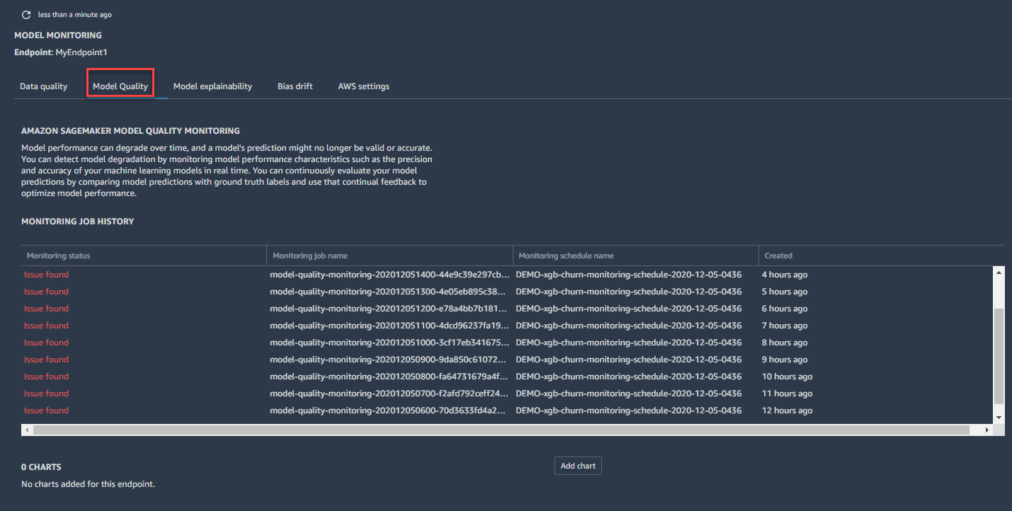
On the endpoint tab, choose the monitoring type for which you want to see job details.
-
Choose the name of the monitoring job run for which you want to view details from the list of monitoring jobs.

-
The MONITORING JOB DETAILS tab opens with a detailed report of the monitoring job.

You can create a chart that displays the baseline and captured metrics for a time period.
To create a chart in SageMaker Studio to visualize monitoring results
-
Sign in to Studio. For more information, see Amazon SageMaker AI domain overview.
-
In the left navigation pane, choose the Components and registries icon (
). -
Choose Endpoints in the drop-down menu.
-
On the Endpoint tab, choose the monitoring type you want to create a chart for. This example shows a chart for the Model quality monitoring type.
-
Choose Add chart.

-
On the CHART PROPERTIES tab, choose the time period, statistic, and metric that you want to chart. This example shows a chart for a Timeline of 1 week, the Average Statistic of, and the F1 Metric.

-
The chart that shows the baseline and current metric statistic you chose in the previous step shows up in the Endpoint tab.

