The SiteWise Monitor feature will no longer be open to new customers starting November 7, 2025 . If you would like to use SiteWise Monitor, sign up prior to that date. Existing customers can continue to use the service as normal. For more information, see SiteWise Monitor availability change
Choose visualization types
This section describes the available visualization types. To understand your devices, processes, and equipment, you should choose the right type of visualization for each asset property that you add to a dashboard. Each visualization type is covered in detail in this section. Changing the visualization type doesn't change your data, so you can try different visualizations to discover which type helps you and your project's viewers gain insights from the data.
| Type | Description | Displays alarm state |
|---|---|---|
| Best used for properties with frequently reported values where you want to see the trend over time. | No | |
| Best used for properties with frequently reported values where you want to see the individual data points. | No | |
| Best used for properties with infrequently reported values, such as daily metrics, where you want to see the trend over time. You can also use bar charts to compare values between multiple properties. | No | |
| Best used for alarms and properties that have a small number of states, such as high, medium, and low. You can visualize current status as a grid or historical status as a timeline. | Yes | |
| Best used for properties where the latest value is the most important piece of information. | No | |
| Best used to compare values between multiple properties or alarms and display information in one compact widget. | Yes |
Line
A line graph is a good way to visualize time series data that fluctuates over time. When you drag a time series property to the dashboard, the values for that property are shown as a line graph by default. If that property has an alarm, the line chart shows that alarm's threshold.
The following line chart shows four asset properties.
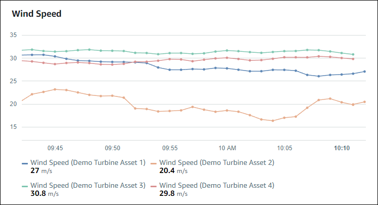
To display a line graph, choose the line graph icon from the visualization type menu.

Scatter
You can use a scatter chart to visualize time series data with distinct data points. A scatter chart looks like a line graph without lines between data points. If you add a property that has an alarm, the scatter chart shows that alarm's threshold.
The following scatter chart shows one asset property.
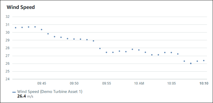
To display a scatter chart, choose the scatter icon from the visualization type menu.

Bar
A bar chart is another way to visualize time series data. You might use a bar chart when your data values change infrequently, such as daily readings. If you add a property that has an alarm, the bar chart shows that alarm's threshold.
The following bar chart shows four asset properties.
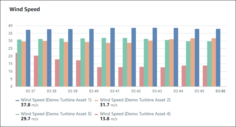
To display a bar graph, choose the bar graph icon from the visualization type menu.

Status
A status widget is a good way to visualize data that has a small number of well-defined states, such as an alarm. For example, if you have a pressure indicator that can be high, medium, or low, you could display each state in a different color with a status grid.
You can configure a status widget to show current status as a grid or historical status as a timeline.
Status grid
The following status grid shows the status of four asset properties.

To display a status grid widget, choose the status grid icon from the visualization type menu.

Status timeline
The following status timeline shows the status over time for four asset properties.
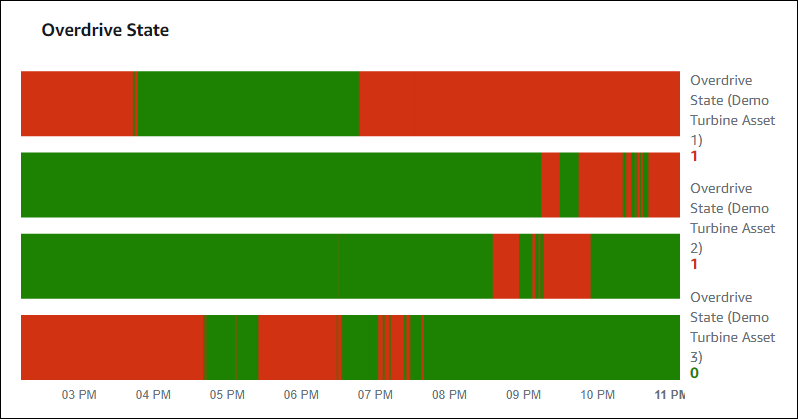
To display a status timeline widget, choose the status timeline icon from the visualization type menu.

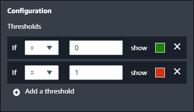
Configure status widgets
To set status colors, configure thresholds with the color and rule for each status. For more information, see Configure thresholds.
You can also configure what information the widget displays about asset properties.
To toggle property units and values
-
Choose the Configuration icon for the status widget to change.
-
Select or clear the Show labels option. When this option is enabled, the widget displays the unit and value of each asset property.
-
After you finish editing the dashboard, choose Save dashboard to save your changes. The dashboard editor closes. If you try to close a dashboard that has unsaved changes, you're prompted to save them.
KPI
The KPI visualization provides a compact representation when you need an overview of your asset properties. This overview gives you the most critical insights into the overall performance of your devices, equipment, or processes. You can change the title of each property within the visualization.
The following is a key performance indicator (KPI) visualization that shows four asset properties.
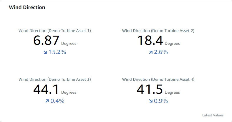
The KPI visualization shows the following information:
-
The latest value for an asset property or the latest state of an alarm for the selected time range.
-
The trend for that value compared to a previous value, which is the first data point before the selected time range.
To display a KPI, choose the KPI icon from the visualization type menu.

Table
The table widget provides a compact representation of multiple asset properties or alarms. You can use the overview to see detailed information about the performance of multiple devices, equipment, or processes.
You can display either properties or alarms in a table. You can't display properties and alarms in the same table.
The following is a table widget that shows four asset properties.

To display a table widget, choose the table icon from the visualization type menu.

