SaaS Unit Metrics
Last Updated
November 2023
Introduction
From time to time, customers will have concerns such as: "my AWS bills are going up and I don’t know whether that’s a good thing or a bad thing". Did the bill go up because they are operating more workloads in the cloud, or is it because they are using AWS inefficiently? … Perhaps, a little bit of both. Regardless of the reason, the most often encountered interpretation is that more spend is bad. That isn’t always the case.
When your AWS invoice is viewed without the appropriate context, it is hard to tell if an increase in spend is a result of delivering more value from your use of the Cloud, or if it is due to inefficient and wasteful resource consumption. Being able to tell the difference is important. You’re now likely asking: "well, how do I tell the difference?" … Simply stated: with unit metrics.
This hands-on lab will guide you through the steps required to add your business data to a visualization that represents a "cost-per" unit metric. This will provide context to as to whether changes to your AWS Cloud architecture and operations are improving, maintaining, or eroding gross profit margins.
Source Some Metrics
For this example, we will use the number of API calls to our service on
a daily basis. To acquire something that resembles real life, we will
use these publicly available statistics
-
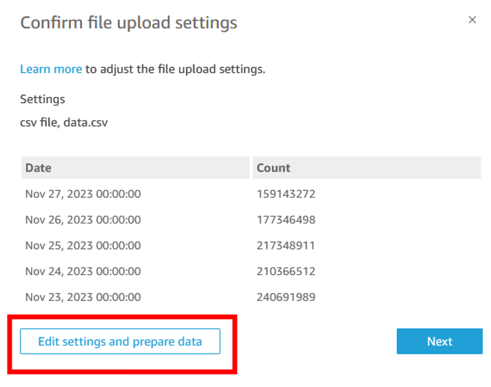
Create a CSV file with this data.
-
Go to QuickSight>>Datasets and click New dataset.
-
Click on upload a file. Select the CSV you’ve created. Click next then click Edit settings and prepared data.
-
Make sure that the date field in your dataset is of type date. Change it if it is not.

-
Click Save & Publish and return to the list of your datasets in QuickSight.
-
Click on summary_view and select EDIT DATASET.

-
Click on Add data. Select from a dataset. Find your uploaded dataset and click Select.

-
Click on the two pink dots next to your dataset. Select Left in the join clauses section below select the Usage_Date field on the left for Summary_View and the Date field from your uploaded dataset on the right. Click Apply. Then click Save & publish.

Customize your Dashboard
For this guide we will use the Cost Intelligence Dashboard deployed in the earlier part of this lab.
-
Open the Analysis version of your dashboard so we can edit it. Start by adding a new tab on the far right side of the dashboard. Rename it to "Unit Metrics".

-
Lets start by creating a per API cost field. On the top right click Insert and then Add calculated field.

-
Call it Cost per API Call and add syntax to divide your Cost field by the new API Count field you imported. Click save.

-
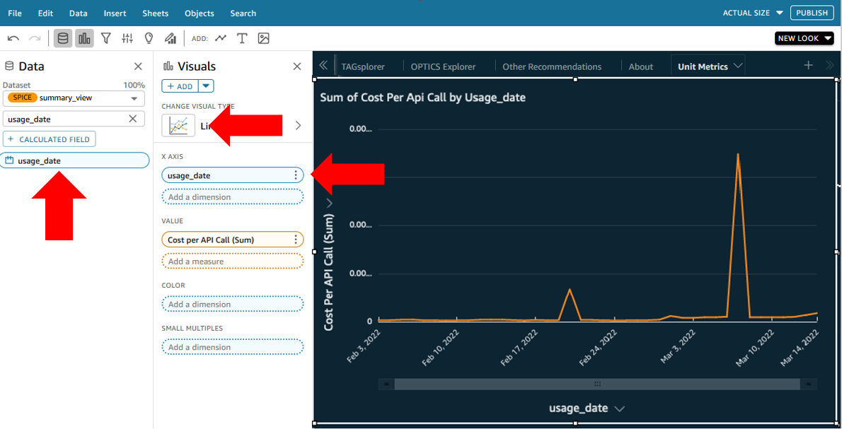
Let’s add a visual that shows us our new Cost per API call day over day. Click Visualize and select Add visual. Drag over your new Cost Per API Call field into the new visuals.

-
Let’s change this to a line graph that shows day-over-day trends. Click on the Line Chart visual type. Next, add the usage_date field to your X axis.
-
We now see our per API call unit cost day-over-day. Lets map the number of API calls on top of this to see the correlation.

-
Tough to see it if our AWS spend is small. Let’s give the API count its own Y axis.

-
Now we have a visual that shows us the correlation between API counts and the cost per API on that day. But it might be difficult to talk about a cost per API call if its less than $0.01 on average. So how do we adjust the multiplier so we can talk about cost per 10,000 API requests? We will add a control and a parameter in QuickSight to accomplish this. Click on Data, then Add Parameters. Set it to an intInteger, give it a name, and set the default to 10.

-
On the next selection screen, pick Control. On the next screen, give the control a name (this will be seen in the dashboard), select Dropdown or List for Style, and put in some multiplier options. I chose 1 through 1 million by orders of magnitude. Check "Hide select all option…".

-
The control will appear at the top of your dashboard. Click on it, click the three dots, select Move to sheet. Position it at the top or wherever you like.

-
Now we need to tie whatever someone selects here to the actual per API cost value. Create a new calculated field called Adjusted API Count and set it to be {API Count}/${APIcallmultiplier}_. The APIcallmultiplier is the name of the parameter you just created. Click save. Next swap the API count field for the new Adjusted API Count calculated field. Finally, edit the Cost Per API Call calculated field we created in step 3 to be Cost/{Adjusted API Count}.

-
Now when you select a multiplier from your drop down or list, the cost per API call amounts in the graph should change by that order of magnitude.
-
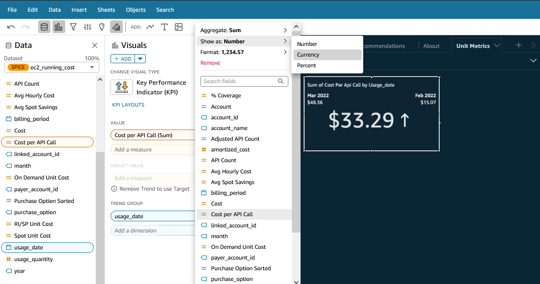
Lets add a few more visuals to get you familiar with what else you can do. Create a new visual, and in the Visual Types section choose KPI indicator.
-
In the Field Wells along the top of the dashboard put the usage_date in as the Trend group, click on the arrow next to it and select Aggregate and choose month. Next, put the Cost Per API call field into the Value box. And finally, to get rid of all those decimal places, select the Cost per API call field in the well, click on the down arrow next to it and select Show as: Currency.
-
Now we can see how our cost per API call month-over-month changed from this month to the prior month. Finally, lets add a table where you can dig into the details and see cost per API call per service, per tag, per business unit, per account, per region, etc.
-
Create a new visual and set the visual type to Pivot Table. In the Values field well put Cost Per API Call set to Currency. In columns put usage_date set to aggregate monthly. In rows, put the dimensions you want to group on, for example tags, service, and operation.

Note
Note the little plus and minus signs next to the values in the columns and rows to the left. You can click on them to zoom in and see more granularity. For example, pick a tag value in the first column and click plus, then click plus on the relevant service, then click plus again to see the operations. Now you should be able to see the cost per API per operation, grouped by tag and service.
Next Steps
-
Now that you know how to add controls, you might consider adding a control for a start date and end date to give users the ability to set the time being considered across all the visuals.
-
Explore QuickSight forecast features to see if you can forecast what your cost per API call will be in the future.
