Colors in visual types in QuickSight
You can change the color of one, some, or all elements on the following types of charts:
-
Bar charts
-
Donut charts
-
Gauge charts
-
Heat maps
-
Line charts
-
Scatter plots
-
Tree maps
To change colors on bar charts, donut charts, gauge charts, line charts, and scatter plots, see Changing colors on charts.
To change colors on heat maps and tree maps, see Changing colors on heat maps and tree maps.
Changing colors on charts
You can change the chart color used by all elements on the chart, and also change the color of individual elements. When you set the color for an individual element, it overrides the chart color.
For example, suppose that you set the chart color to green.
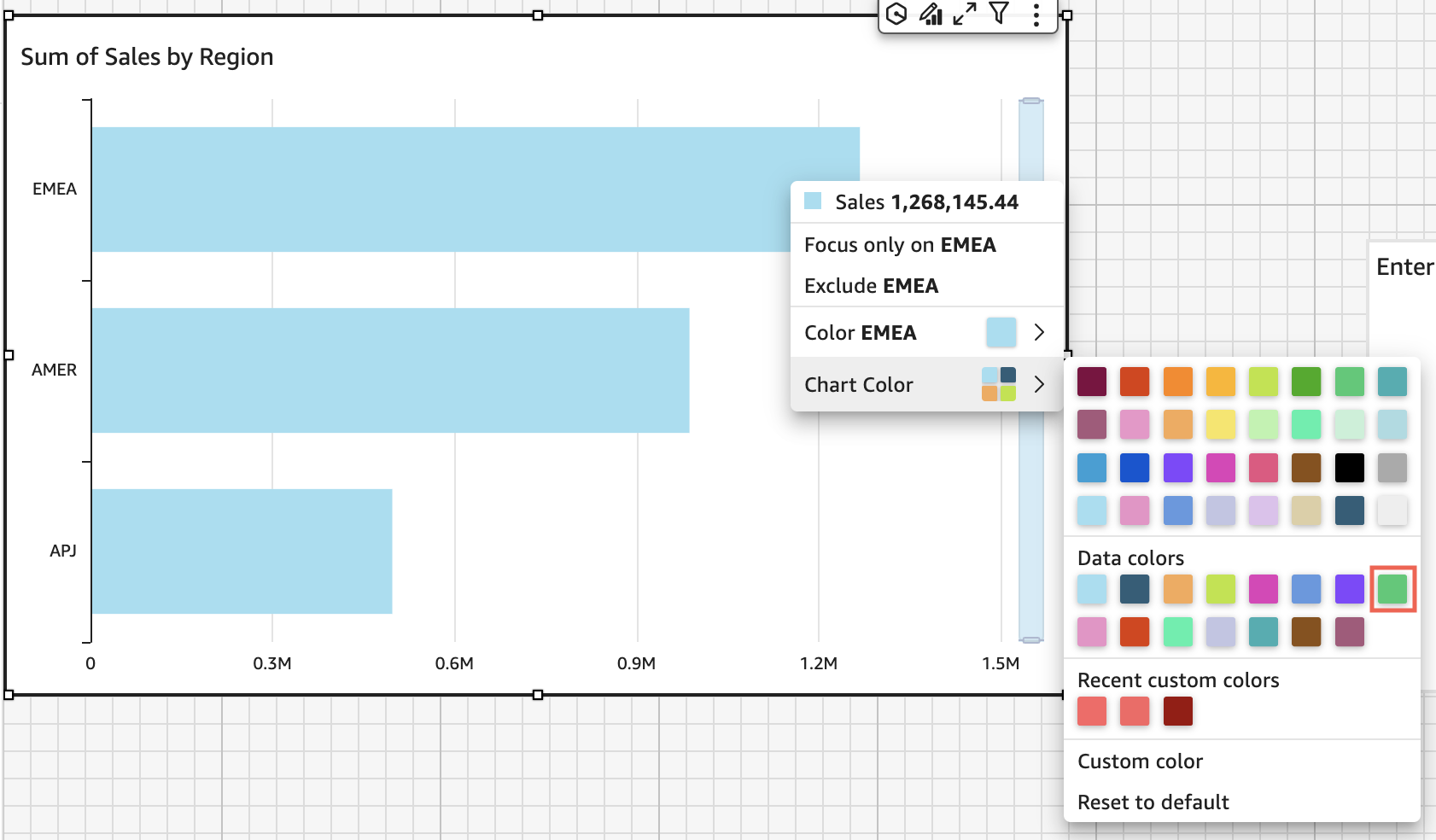
All of the bars turn green. Even though you choose the first bar, the chart color applies to all the bars. Then you set the color for the SMB bar to blue.
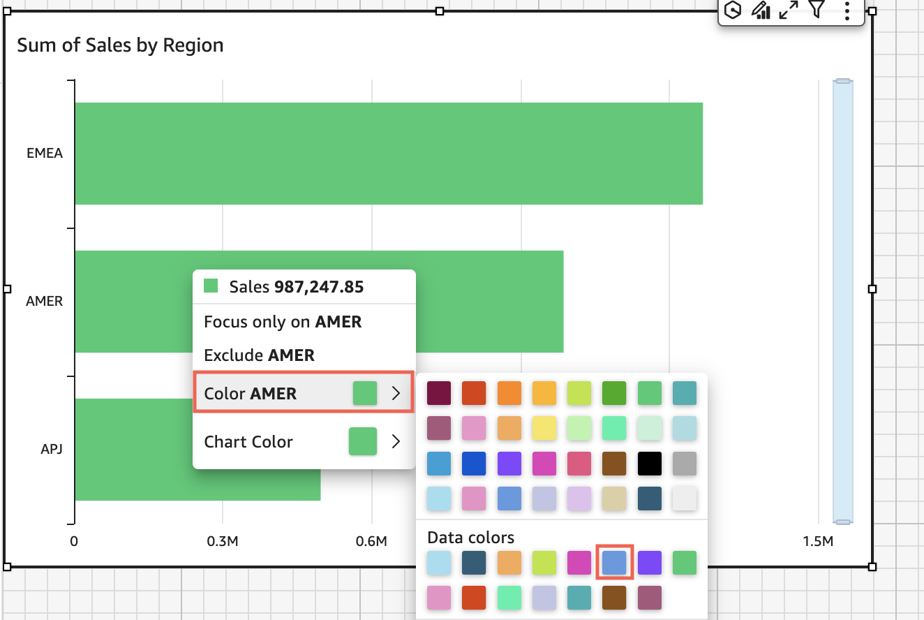
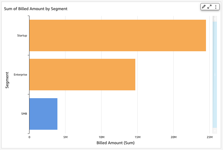
Looking at the result, you decide that you need more contrast between the green and blue bars, so you change the chart color to orange. If you are changing the chart color, it doesn't matter which bar you choose to open the context menu from.

The SMB bar remains blue. This is because it was directly configured. The remaining bars turn orange.
When you change the color of an element that is grouped, the color for that element is changed in all of the groups. An example is a bar in a clustered bar chart. In the following example, Customer Segment is moved out of the Y-axis and into the Group/Color field well. Customer Region is added as the Y-axis. The chart color stays orange, and SMB stays blue for all Customer Regions.

If your visual has a legend that shows categories (dimensions), you can click on the values in the legend to see a menu of available actions. For example, suppose that your bar chart has a field in the Color or Group/Color field well. The bar chart menu displays the actions that you can choose by clicking or right-clicking on a bar, such as the following:
-
Focusing on, or excluding, visual elements
-
Changing colors of visual elements
-
Drilling down into a hierarchy
-
Custom actions activated from the menu, including filtering or URL actions
Following is an example of using the legend to change the color for a dimension.

Setting new colors for a visual
Use the following procedure to change the colors for a visual.
To change the colors for a visual
-
On the analysis page, choose the visual that you want to modify.
-
To change the chart color, choose any element on the visual, and then choose Chart Color.
To select elements, do the following:
-
On a bar chart, choose any bar.
-
On a line chart, choose the end of a line.
-
On a scatter plot, choose an element. The field must be in the Group/Color section of Field wells.
-
-
Choose the color that you want to use. You can choose a color from the existing palette, or you can choose a custom color. To use a custom color, enter the hexadecimal code for that color.
All elements on the visual are changed to use this color, except for any that have previously had their color individually set. In that case, the element color overrides the chart color.
-
To change the color for a single element on the visual, choose that element, choose Color <field name>, and then choose the color that you want to use. You can choose a color from the existing palette, or you can choose a custom color. To use a custom color, enter the hexadecimal code for that color.
Repeat this step until you have set the color on all elements that you want to modify. To change the color back to the color it was originally, choose Reset to default.
Setting visual colors back to defaults
Use the following procedure to return to using the default colors on a visual.
To return to default colors on a visual
-
On the analysis page, choose the visual that you want to modify.
-
Choose Chart Color, choose any element on the visual, and then choose Reset to Default. Doing this changes the chart color back to the default color for that visual type.
All elements on the visual are changed to the default color for the visual type, except for any that have previously had their color individually set. In that case, the element color setting overrides the chart color setting.
-
To change the color for a single element back to the default, choose that element, choose Color <field name>, and then choose Reset to Default.
The default color for individual elements is the chart color if you have specified one, or the default color for the visual type otherwise.
Changing colors on heat maps and tree maps
To change the colors that display on a heat map or a tree map
-
Choose the heat map or tree map that you want to edit.
-
Choose Expand for the settings menu, and choose the cog icon to open the Properties panel.
-
For Color, choose the settings that you want to use:
-
For Gradient color or Discrete color, choose the color square next to the color bar, and then choose the color that you want to use. Repeat for each color square. The bar holds two colors by default.
-
Select the Enable 3 colors check box if you want to add a third color. A new square appears in the middle of the color bar.
You can enter a number that defines the midpoint between the two main gradient colors. If you add a value, the middle color represents the number you entered. If you leave this blank, the middle color acts like the other colors in the gradient.
-
Select the Enable steps check box if you want to limit the chart to the colors that you chose. Doing this changes the label on the color bar from Gradient color to Discrete color.
-
For Color for Null Value, choose a color to depict NULL values. This option is only available on heat maps.
