Tooltips on visual types in QuickSight
When you hover your cursor over any graphical element in an Amazon QuickSight visual, a tooltip appears with information about that specific element. For example, when you hover your cursor over dates in a line chart, a tooltip appears with information about those dates. By default, the fields in the Fields well determine what information displays in tooltips. Tooltips can display up to 10 fields.
You can provide your viewers with additional information about data in your visual, customizing what viewers can see. You can even prevent tooltips from appearing when viewers hover a cursor over an element. To do this, you can customize the tooltips for that visual.
Customizing tooltips in a visual
Use the following procedure to customize tooltips in a visual.
To customize tooltips in a visual
-
On the analysis page, choose the visual that you want to format.
-
On the menu in the upper-right corner of the visual, choose the Format visual icon.

-
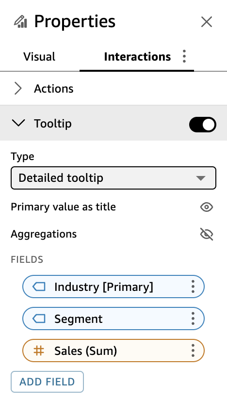
In the Properties pane that opens, choose Tooltip.
-
For Type, choose Detailed tooltip.
A new set of options appear, as shown following.
To show or hide titles in a tooltip
-
Choose Use primary value as title.
Clearing the option hides titles in the tooltip. Selecting the option shows the primary field value as the title in the tooltip.
To show or hide aggregations for fields in the tooltip
-
Choose Show aggregations.
Clearing the option hides the aggregation for fields in the tooltip. Selecting the option shows the aggregation for fields in the tooltip.
To add a field to the tooltip
-
Choose Add field.
-
In the Add field to tooltip page that opens, choose Select field and then select a field from the list.
You can add up to 10 fields to tooltips.
-
(Optional) For Label, enter a label for the field. This option creates a custom label for the field in the tooltip.
-
(Optional) Depending on whether you add a dimension or a measure, choose how you want the aggregation to display in the tooltip. If you don't select an option, QuickSight uses the default aggregation.
If you add a measure to the tooltip, you can select how you want the field to be aggregated. To do so, choose Select aggregation, and then select an aggregation from the list. For more information about the types of aggregations in QuickSight, see Changing field aggregation.
-
Choose Save.
A new field is added to the list of fields in your tooltip.
To remove a field from the tooltip
-
Under the Fields list, select the field menu for the field that you want to remove (the three dots) and choose Hide.
To rearrange the order of the fields in the tooltip
-
Under the Fields list, select the field menu for a field (the three dots) and choose either Move up or Move down.
To customize the label for a field in the tooltip
-
Select the field menu for the field that you want to customize (the three dots) and choose Edit.
-
In the Edit tooltip field page that opens, for Label, enter the label that you want to appear in the tooltip.
-
Choose Save.
Hiding tooltips in a visual
If you don't want tooltips to appear when you hover your cursor over data in a visual, you can hide them.
To hide tooltips in a visual
-
On the analysis page, choose the visual that you want to format.
-
On the menu in the upper-right corner of the visual, choose the Format visual icon.
-
In the Properties pane that opens, choose Tooltip.
-
Choose Show tooltip.
Clearing the option hides tooltips for the visual. Selecting the option shows them.
