Customizing visuals in a free-form layout
You can use the free-form layout to fully customize the color, size, location, and visibility of each visual in a dashboard.
Organizing visuals
Besides dragging a visual to its preferred location within a dashboard, there are many different ways to move a visual to the exact location it needs to be.
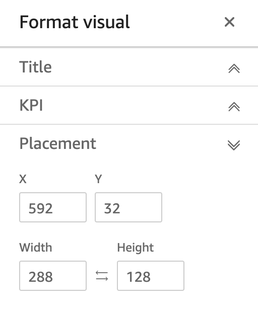
To enter the coordinates of the visual's location
-
Choose the visual that you want.
-
On the menu in the upper-right corner of the visual, select the Format visual icon.

-
In the Properties pane that opens, choose Placement.
-
Enter the X and Y coordinates of the location you want to place your visual. You can also adjust the size of the visual by entering Width and Height values.
Selected visuals can also be moved pixel-by-pixel using your keyboard's arrow keys.
You can overlay visuals on top of one another to create multi-layered visuals that show data.

Visuals can be organized into multiple layers that can be manually moved to the front and back.
To move overlaid visuals to the front and back
-
Choose the visual that you want.
-
On the menu in the upper-right hand side of the visual, choose Menu options.
-
For Menu options, choose from the following:
-
Send to back sends the visual to the back.
-
Send backward sends the visual one layer back.
-
Bring forward rings the visual one layer forward.
-
Bring to front brings a visual to the front.
-

Changing a visual's background color
The colors of a visual’s background, border, and selection frame can be customized in the Display settings pane of the Properties pane.
To change the color of a visual's background, border, or selection frame
-
Choose the visual that you want to change.
-
On the menu in the upper-right hand side of the visual, choose the Properties icon.
-
In the Properties pane that appears on the left, choose Display settings.
-
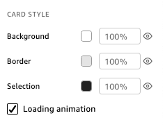
Navigate to the Card style section and perform one or more of the available actions:
-
To change the color of a visual's background, choose the Background color box, and then choose the color that you want.
-
To change the color of a visual's border, choose the Border color box, and then choose the color that you want.
-
To change the color of a visual's selection frame, choose the Selection color box, and then choose the color that you want.
The image below shows the Card style section of the Display settings menu.
If you want to use a custom color for your visual's background, border, or selection frame, choose the color box of the property that you want to change, and then choose Custom color. In the Custom color window that appears, choose your custom color or enter the color's hexadecimal code. When you are finished, choose Apply.
-
You can also reset a visual's customized background back to its default appearance.
To reset the appearance of a visual
-
Choose the visual that you want to change.
-
On the menu in the upper-right hand side of the visual, choose the Properties icon.
-
In the Properties pane that appears on the left, choose Display settings.
-
Choose the color that you want to reset, and then choose Reset to default.
Hiding visual backgrounds, borders, and selection colors
You can also choose not to show the background border, or selection color of a visual. This is useful for when you want to overlap multiple visuals. You can hide a visual’s background, border, and selection colors by choosing the eye icon next to the Border, Background, or Selection color boxes. You can also remove a visual’s loading animation by clearing the Show loading animation box. The image below shows the hide visual icon.

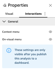
Disabling visual menus
Use the Interactions panel of the Properties pane to hide the Context menu and On-visual menu from selected visuals. You can hide secondary visual menus to make the visual less crowded or to make a visual act like an overlay.
The Context menu opens on data-point clicks. Common actions in the Context menu include Focus, Exclude, and Drill-down.

The On-visual menu appears on the top-right side of a visual. The On-visual menu is used to access the Proeprties pane, Maximize the visual, access the Menu options panel, and review an Anomaly insight.

You can turn off the secondary visual menus by clearing the Context menu and On-visual menu options.
Note
You can't preview changes to the Interactions panel in Analyses. Publish the dashboard to view your changes.