Adding data bars to tables in QuickSight
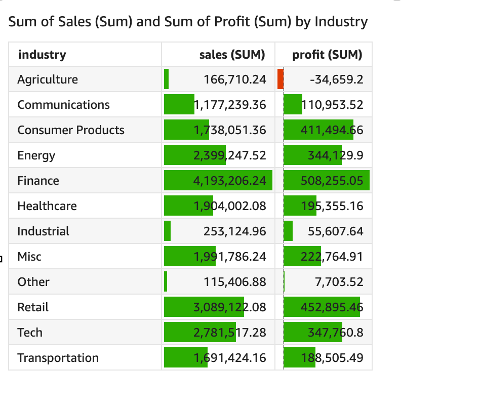
You can use data bars to add visual context to your table visuals in Amazon QuickSight. By injecting color into your tables, data bars can make it easier to visualize and compare data in a range of fields. Data bars are bars of different colors or shades that you add to the cells of a table. The bars are measured relative to the range of all cells in a single column, which is similar to a bar chart. You can use data bars to highlight a fluctuating trend, such as profit per quarter during the year.
You can only apply data bars to fields that are added to the Values field well of the visual. You can't apply data bars to items that are added to group bys.
You can create up to 200 different data bar configurations for a single table.
To add data bars to a table
-
On the analysis page, choose the visual that you want to format.
-
On the menu in the upper-right corner of the visual, select the Format visual icon. The Format visual pane opens.
-
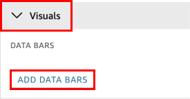
In the Properties pane, open the Visuals dropdown list and choose ADD DATA BARS.
-
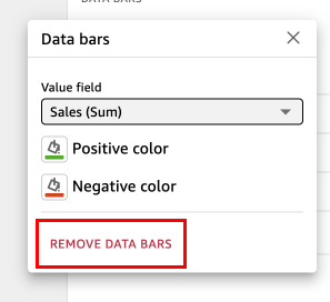
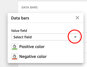
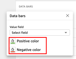
In the Data bars popup that appears, choose the value field that you want represented by the data bars. You can only choose from fields that are added to the Values field well of the visual.
-
(Optional) Choose the icon labeled Positive color to select the color that you want to represent positive value data bars. The default color is green.
-
(Optional) Choose the icon labeled Negative color to select the color that you want to represent negative value data bars. The default color is red.
When you create data bars, they are named for the field values that they are representing. For example, if you add data bars to represent the profit of a product over time, the data bar configuration is labeled "Profit". In the Visuals pane of the Properties menu, data bars are listed in the order that they are created.
To remove data bars from a visual
-
On the menu in the upper-right corner of the visual, select the Format visual icon. The Properties pane opens.
-
In the Properties pane, open the Visuals dropdown list and choose the data bar that you want to remove.
-
Choose REMOVE DATA BARS.