Autopilot data exploration report
Amazon SageMaker Autopilot cleans and pre-processes your dataset automatically. High-quality data improves machine learning efficiency and produces models that make more accurate predictions.
There are issues with customer-provided datasets that cannot be fixed automatically without the benefit of some domain knowledge. Large outlier values in the target column for regression problems, for example, may cause suboptimal predictions for the non-outlier values. Outliers may need to be removed depending on the modeling objective. If a target column is included by accident as one of the input features, the final model will validate well, but be of little value for future predictions.
To help customers discover these sorts of issues, Autopilot provides a data exploration report that contains insights into potential issues with their data. The report also suggests how to handle the issues.
A data exploration notebook containing the report is generated for every Autopilot job. The report is stored in an Amazon S3 bucket and can be accessed from your output path. The path of the data exploration report usually adheres to the following pattern.
[s3 output path]/[name of the automl job]/sagemaker-automl-candidates/[name of processing job used for data analysis]/notebooks/SageMaker AIAutopilotDataExplorationNotebook.ipynb
The location of the data exploration notebook can be obtained from the Autopilot API using
the DescribeAutoMLJob operation response, which is stored in DataExplorationNotebookLocation.
When running Autopilot from SageMaker Studio Classic, you can open the data exploration report using the following steps:
-
Choose the Home icon
 from the left navigation pane to view the
top-level Amazon SageMaker Studio Classic navigation menu.
 -
Select the AutoML card from the main working area. This opens a new Autopilot tab.
-
In the Name section, select the Autopilot job that has the data exploration notebook that you want to examine. This opens a new Autopilot job tab.
-
Select Open data exploration notebook from the top right section of the Autopilot job tab.
The data exploration report is generated from your data before the training process begins. This allows you to stop Autopilot jobs that might lead to meaningless results. Likewise, you can address any issues or improvements with your dataset before rerunning Autopilot. This way, you can use your domain expertise to improve the data quality manually, before you train a model on a better-curated dataset.
The data report contains only static markdown and can be opened in any Jupyter environment.
The notebook that contains the report can be converted to other formats, such as PDF or HTML.
For more information about conversions, see Using the nbconvert script to
convert Jupyter notebooks to other formats.
Topics
Dataset Summary
This Dataset Summary provides key statistics characterizing your dataset including the number of rows, columns, percent duplicate rows and missing target values. It is intended to provide you with a quick alert when there are issue with your dataset that Amazon SageMaker Autopilot has detected and that are likely to require your intervention. The insights are surfaced as warnings that are classified as being of either “high” or “low” severity. The classification depends on the level of confidence that the issue will adversely impact the performance of the model.
The high and low severity insights appear in the summary as pop-ups. For most of the insights, recommendations are offered for how to confirm that there is an issue with the dataset that requires your attention. Proposals are also provided for how to resolve the issues.
Autopilot provides additional statistics about missing or not valid target values in our dataset to help you detect other issues that may not be captured by high severity insights. An unexpected number of columns of a particular type might indicate that some columns that you want to use may be missing from the dataset. It could also indicate that there was an issue with how the data was prepared or stored. Fixing these data problems brought to your attention by Autopilot can improve the performance of the machine learning models trained on your data.
High severity insights are shown in the summary section and in other relevant sections in the report. Examples of high and low-severity insights are usually given depending on the section of the data report.
Target Analysis
Various high and low-severity insights are shown in this section related to the distribution of values in the target column. Check that target column contains the correct values. Incorrect values in target column will likely result in a machine learning model that doesn't serve the intended business purpose. Several data insights of high and low severity are present in this section. Here are several examples.
-
Outlier target values - Skewed or unusual target distribution for regression, such as heavy tailed targets.
-
High or low target cardinality - Infrequent number of class labels or a large number of unique classes for classification.
For both regression and classification problem types, not valid values such as numeric
infinity, NaN or empty space in target column are surfaced. Depending on the
problem type, different dataset statistics are presented. A distribution of target column
values for a regression problem allows you to verify if the distribution is what you
expected.
The following screenshot shows an Autopilot data report, which includes statistics such as the mean, median, minimum, maximum, percentage of outliers in your dataset. The screenshot also includes a histogram showing the distribution of labels in the target column. The histogram shows Target Column Values on the horizontal axis and Count on the vertical axis. A box highlights the Outliers Percentage section of the screenshot to indicate where this statistic appears.
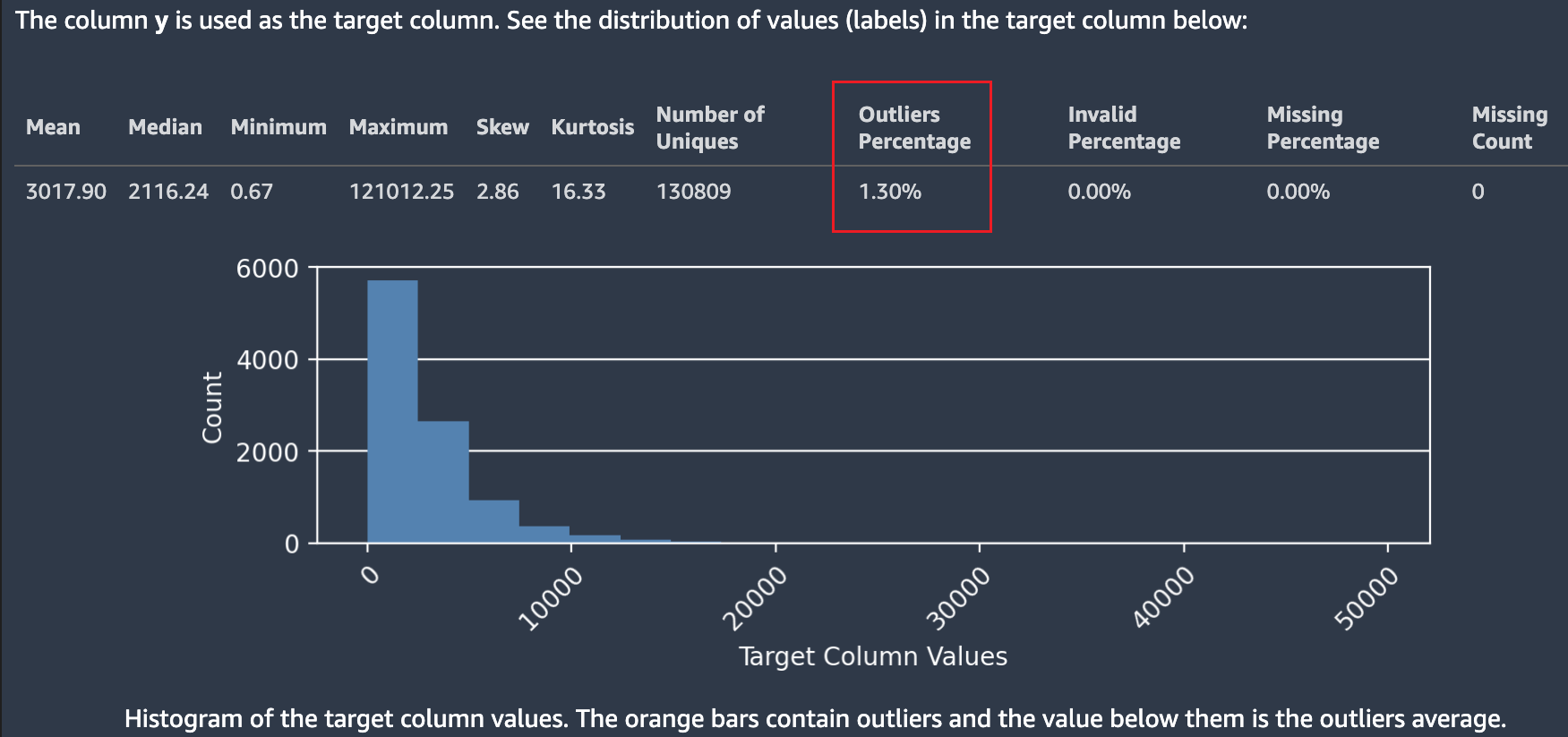
Multiple statistics are shown regarding target values and their distribution. If any of the outliers, not valid values, or missing percentages are greater than zero, these values are surfaced so you can investigate why your data contains unusable target values. Some unusable target values are highlighted as a low severity insight warning.
In the following screenshot, a ` symbol was added accidentally to the target column, which prevented the numeric value of the target from being parsed. A Low severity insight: "Invalid target values" warning appears. The warning in this example states "0.14% of the labels in the target column could not be converted to numeric values. The most common non-numeric values are: ["-3.8e-05","-9-05","-4.7e-05","-1.4999999999999999e-05","-4.3e-05"]. That usually indicates that there are problems with data collection or processing. Amazon SageMaker Autopilot ignores all observations with invalid target label."

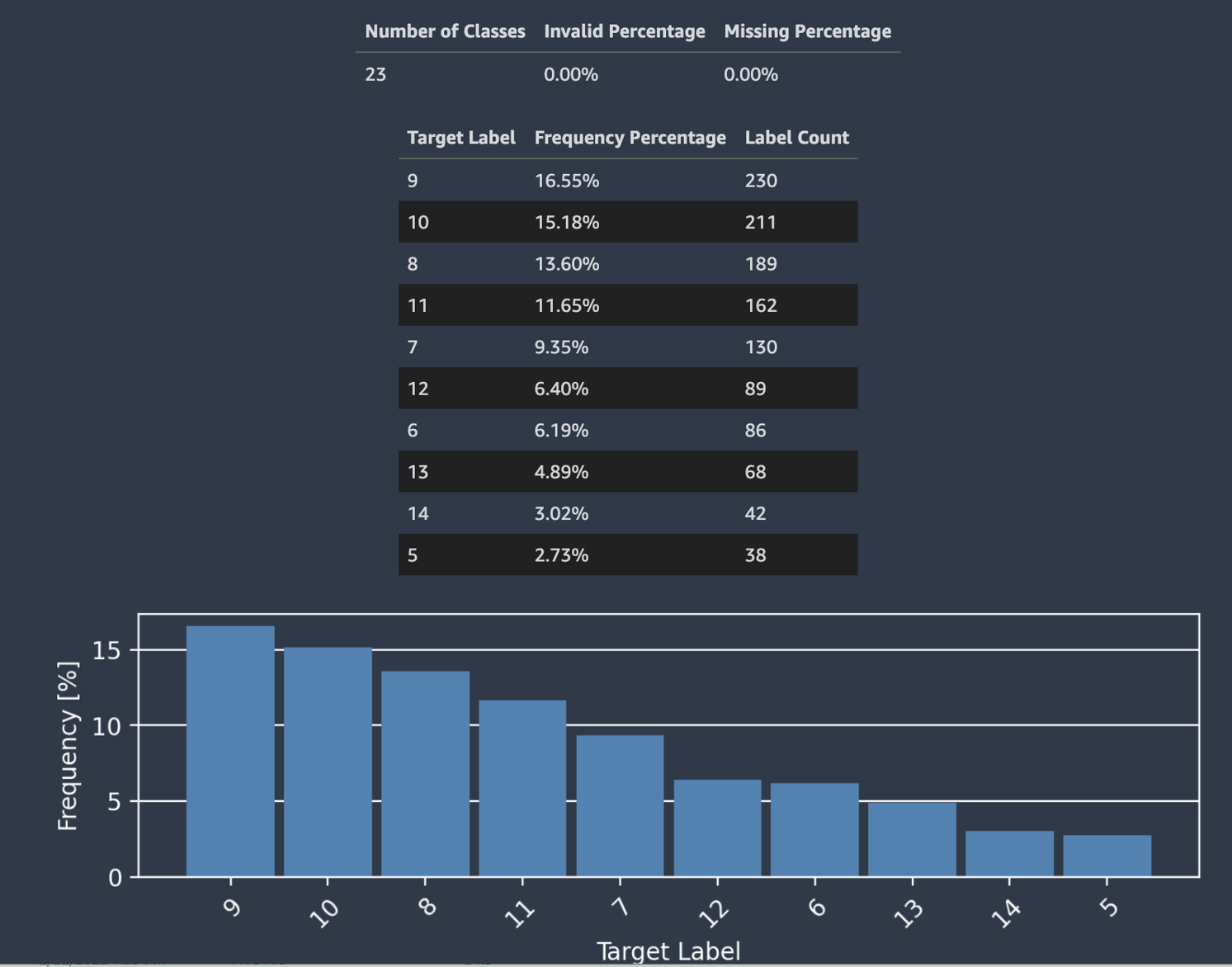
Autopilot also provides a histogram showing the distribution of labels for classification.
The following screenshot shows an example of statistics given for your target column including the number of classes, missing or not valid values. A histogram with Target Label on the horizontal axis and Frequency on the vertical axis shows the distribution of each label category.
Note
You can find definitions of all the terms presented in this and other sections in Definitions section at the bottom of the report notebook.
Data Sample
Autopilot presents an actual sample of your data to help you spot issues with your dataset. The sample table scrolls horizontally. Inspect the sample data to verify that all the necessary columns are present in the dataset.
Autopilot also calculates a measure of prediction power, that can be used to identify a
linear or nonlinear relationship between a feature and the target variable. A value of
0 indicates that the feature has no predictive value in predicting the target
variable. A value of 1 indicates the highest predictive power for the target
variable. For more information on predictive power, see the Definitions
section.
Note
It is not recommended that you use prediction power as a substitute for feature importance. Only use it if you're certain that prediction power is an appropriate measure for your use case.
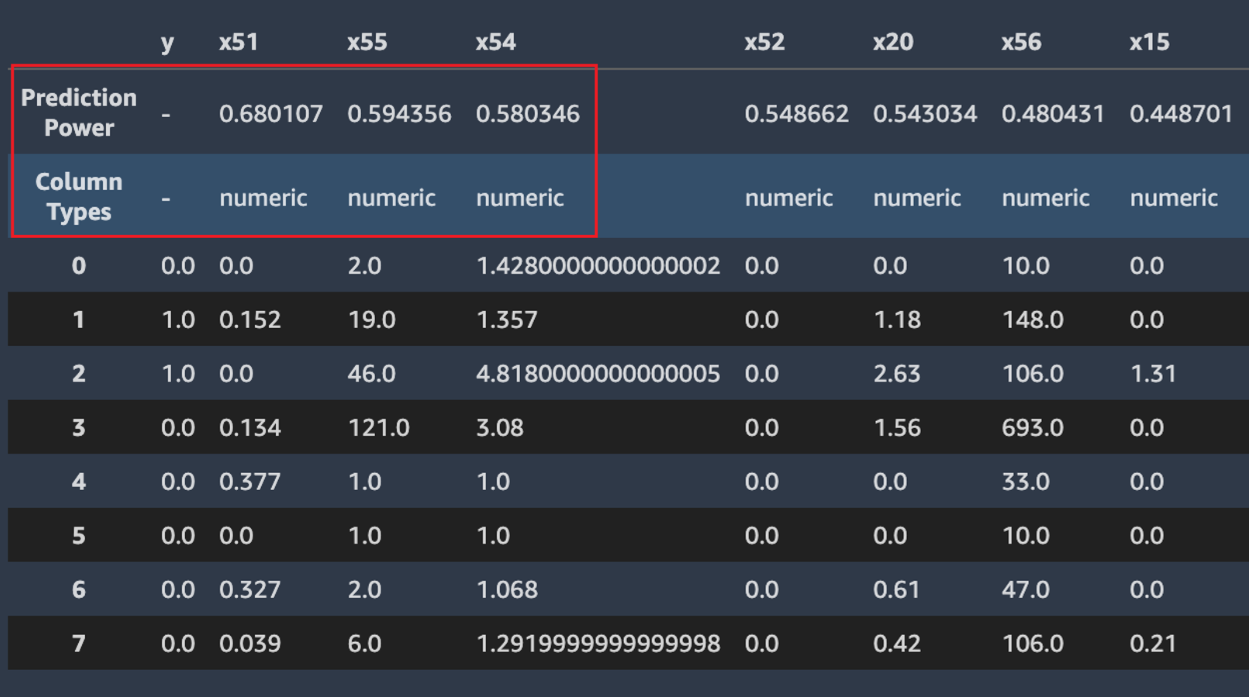
The following screenshot shows example data sample. The top row contains the prediction
power of each column in your dataset. The second row contains the column data type.
Subsequent rows contain the labels. The columns contain the target column followed by each
feature column. Each feature column has an associated prediction power, highlighted in this
screenshot, with a box. In this example, the column containing the feature x51
has a predictive power of 0.68 for the target variable y. The
feature x55 is slightly less predictive with a prediction power of
0.59.
Duplicate rows
If duplicate rows are present in the dataset, Amazon SageMaker Autopilot displays a sample of them.
Note
It is not recommended to balance a dataset by up-sampling before providing it to Autopilot. This may result in inaccurate validation scores for the models trained by Autopilot, and the models that are produced may be unusable.
Cross column correlations
Autopilot uses the Pearson's correlation coefficient, a measure of linear correlation
between two features, to populate a correlation matrix. In the correlation matrix, numeric
features are plotted on both the horizontal and vertical axes, with the Pearson's
correlation coefficient plotted at their intersections. The higher the correlation between
two features, the higher the coefficient, with a maximum value of |1|.
-
A value of
-1indicates that the features are perfectly negatively correlated. -
A value of
1, which occurs when a feature is correlated with itself, indicates perfect positive correlation.
You can use the information in the correlation matrix to remove highly correlated features. A smaller number of features reduces chances of overfitting a model and can reduce the costs of production in two ways. It lessens the Autopilot runtime needed and, for some applications, can make data collection procedures cheaper.
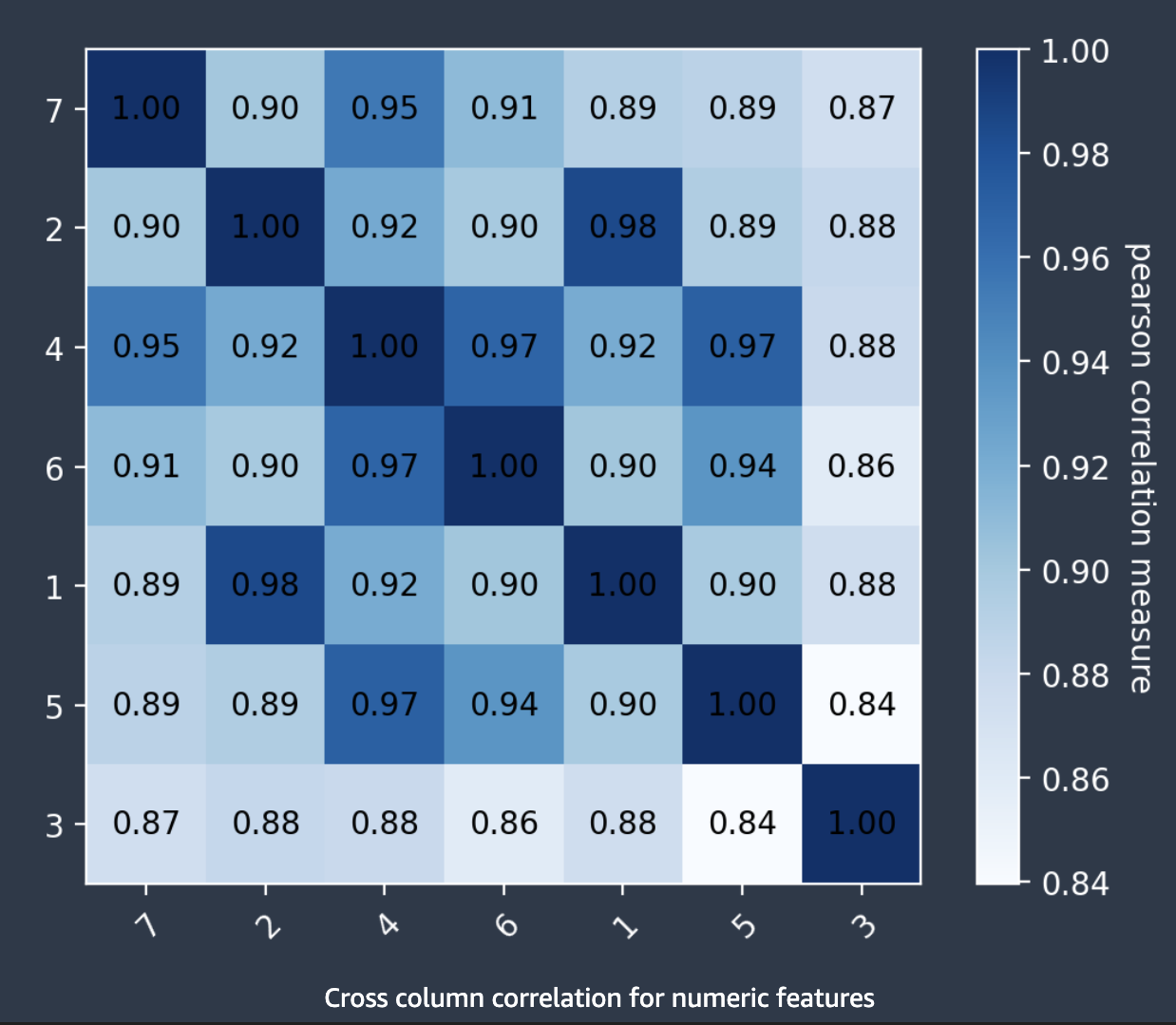
The following screenshot shows an example of a correlation matrix between 7
features. Each feature is displayed in a matrix on both the horizontal and vertical axes.
The Pearson's correlation coefficient is displayed at the intersection between two features.
Each feature intersection has a color tone associated with it. The higher the correlation,
the darker the tone. The darkest tones occupy the diagonal of the matrix, where each feature
is correlated with itself, representing perfect correlation.
Anomalous Rows
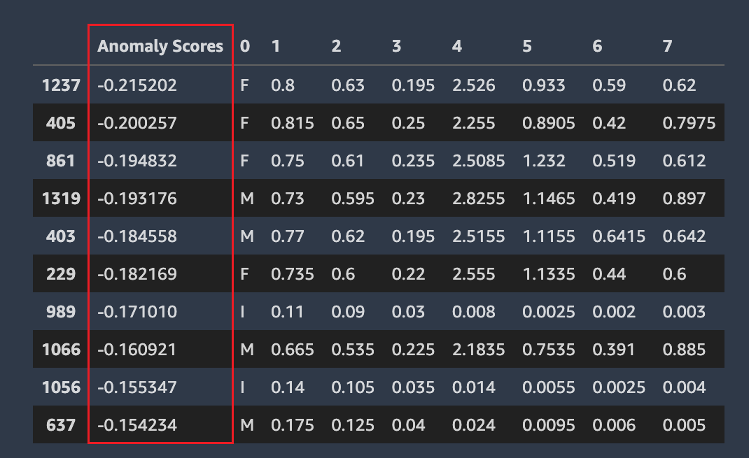
Amazon SageMaker Autopilot detects which rows in your dataset might be anomalous. It then assigns an anomaly score to each row. Rows with negative anomaly scores are considered anomalous.
The following screenshot shows the output from an Autopilot analysis for rows containing anomalies. A column containing an anomalous score appears next to the dataset columns for each row.
Missing values, cardinality, and descriptive statistics
Amazon SageMaker Autopilot examines and reports on properties of the individual columns of your dataset. In each section of the data report that presents this analysis, the content is arranged in order. This is so you can check the most “suspicious” values first. Using these statistics you can improve contents of individual columns, and improve the quality of the model produced by Autopilot.
Autopilot calculates several statistics on the categorical values in columns that contain them. These include the number of unique entries and, for text, the number of unique words.
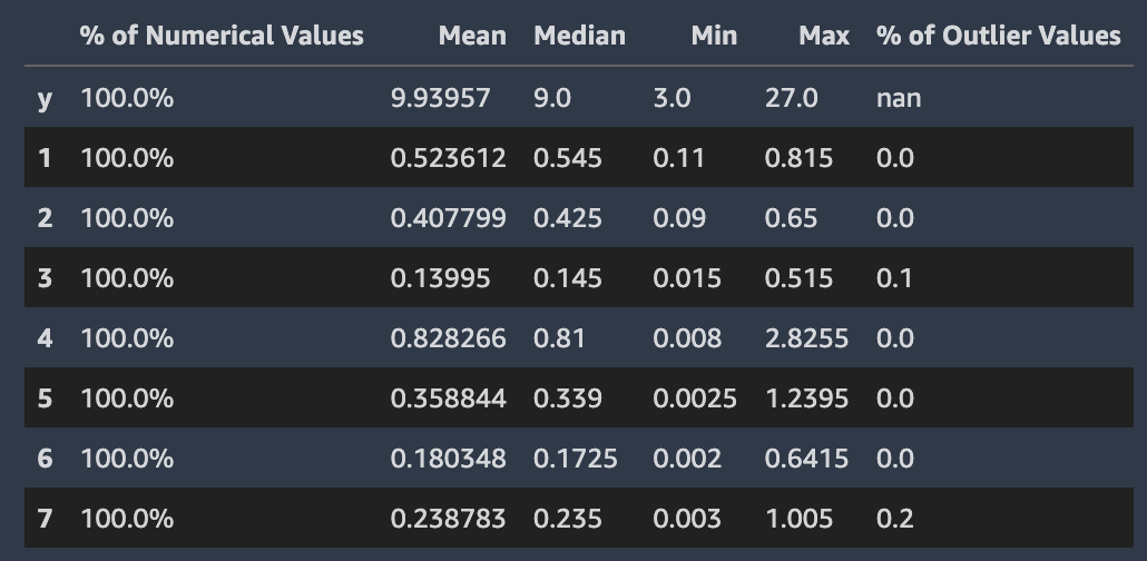
Autopilot calculates several standard statistics on the numerical values in columns that contain them. The following image depicts these statistics, including the mean, median, minimum and maximum values, and the percentages of numerical types and of outlier values.
