Use advanced metrics in your analyses
The following section describes how to find and interpret the advanced metrics for your model in Amazon SageMaker Canvas.
Note
Advanced metrics are only currently available for numeric and categorical prediction models.
To find the Advanced metrics tab, do the following:
-
Open the SageMaker Canvas application.
-
In the left navigation pane, choose My models.
-
Choose the model that you built.
-
In the top navigation pane, choose the Analyze tab.
-
Within the Analyze tab, choose the Advanced metrics tab.
In the Advanced metrics tab, you can find the Performance tab. The page looks like the following screenshot.
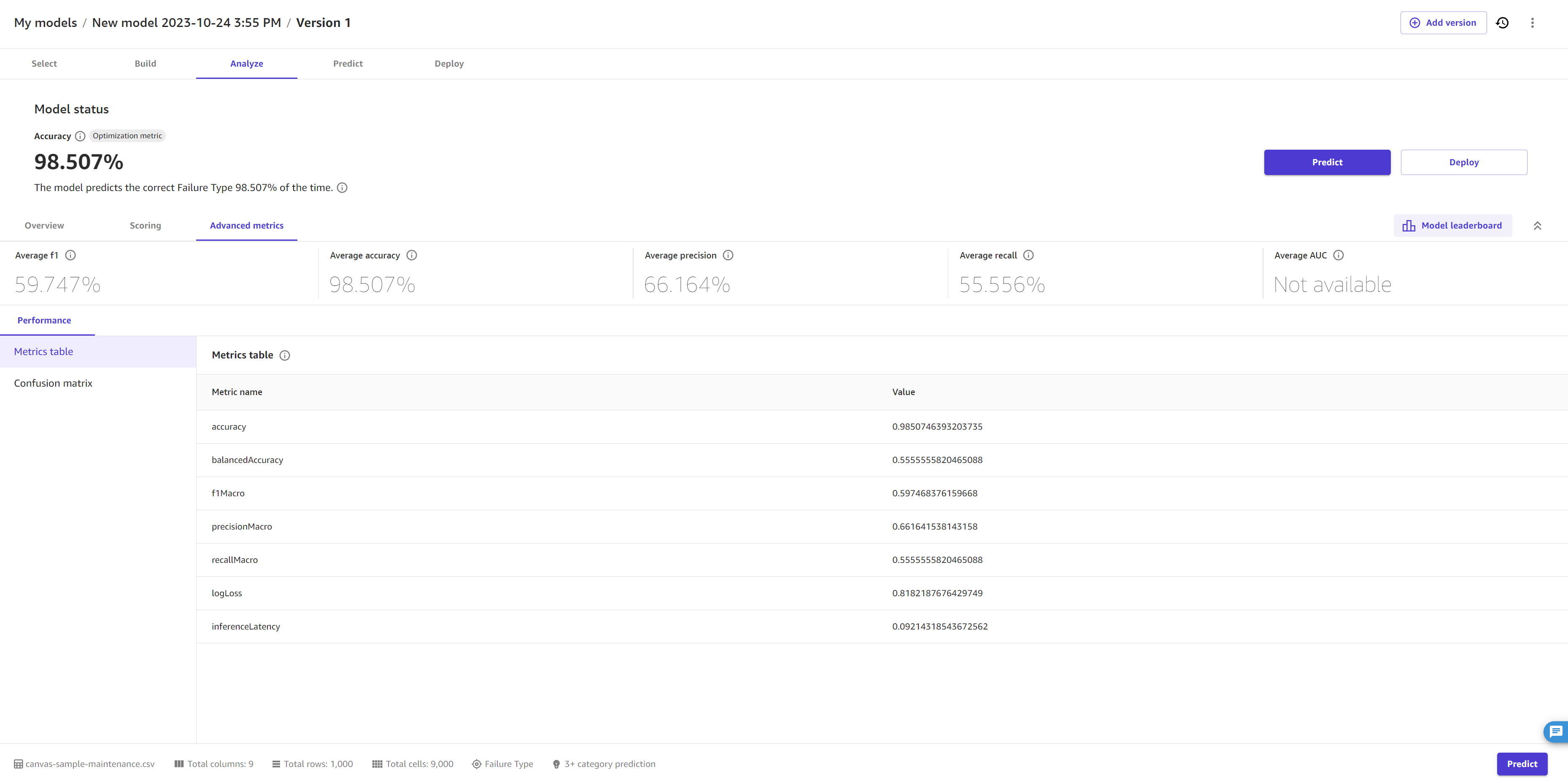
At the top, you can see an overview of the metrics scores, including the Optimization metric, which is the metric that you selected (or that Canvas selected by default) to optimize when building the model.
The following sections describe more detailed information for the Performance tab within the Advanced metrics.
Performance
In the Performance tab, you’ll see a Metrics table, along with visualizations that Canvas creates based on your model type. For categorical prediction models, Canvas provides a confusion matrix, whereas for numeric prediction models, Canvas provides you with residuals and error density charts.
In the Metrics table, you are provided with a full list of your model’s scores for each advanced metric, which is more comprehensive than the scores overview at the top of the page. The metrics shown here depend on your model type. For a reference to help you understand and interpret each metric, see Metrics reference.
To understand the visualizations that might appear based on your model type, see the following options:
-
Confusion matrix – Canvas uses confusion matrices to help you visualize when a model makes predictions correctly. In a confusion matrix, your results are arranged to compare the predicted values against the actual values. The following example explains how a confusion matrix works for a 2 category prediction model that predicts positive and negative labels:
-
True positive – The model correctly predicted positive when the true label was positive.
-
True negative – The model correctly predicted negative when the true label was negative.
-
False positive – The model incorrectly predicted positive when the true label was negative.
-
False negative – The model incorrectly predicted negative when the true label was positive.
-
-
Precision recall curve – The precision recall curve is a visualization of the model’s precision score plotted against the model’s recall score. Generally, a model that can make perfect predictions would have precision and recall scores that are both 1. The precision recall curve for a decently accurate model is fairly high in both precision and recall.
-
Residuals – Residuals are the difference between the actual values and the values predicted by the model. A residuals chart plots the residuals against the corresponding values to visualize their distribution and any patterns or outliers. A normal distribution of residuals around zero indicates that the model is a good fit for the data. However, if the residuals are significantly skewed or have outliers, it may indicate that the model is overfitting the data or that there are other issues that need to be addressed.
-
Error density – An error density plot is a representation of the distribution of errors made by a model. It shows the probability density of the errors at each point, helping you to identify any areas where the model may be overfitting or making systematic errors.
