Explore your data using analytics
Note
You can only use SageMaker Canvas analytics for models built on tabular datasets. Multi-category text prediction models are also excluded.
With analytics in Amazon SageMaker Canvas, you can explore your dataset and gain insight on all of your variables before building a model. You can determine the relationships between features in your dataset using correlation matrices. You can use this technique to summarize your dataset into a matrix that shows the correlations between two or more values. This helps you identify and visualize patterns in a given dataset for advanced data analysis.
The matrix shows the correlation between each feature as positive, negative, or neutral. You might want to include features that have a high correlation with each other when building your model. Features that have little to no correlation might be irrelevant to your model, and you can drop those features when building your model.
To get started with correlation matrices in SageMaker Canvas, see the following section.
Create a correlation matrix
You can create a correlation matrix when you are preparing to build a model in the Build tab of the SageMaker Canvas application.
For instructions on how to begin creating a model, see Build a model.
After you’ve started preparing a model in the SageMaker Canvas application, do the following:
-
In the Build tab, choose Data visualizer.
-
Choose Analytics.
-
Choose Correlation matrix.
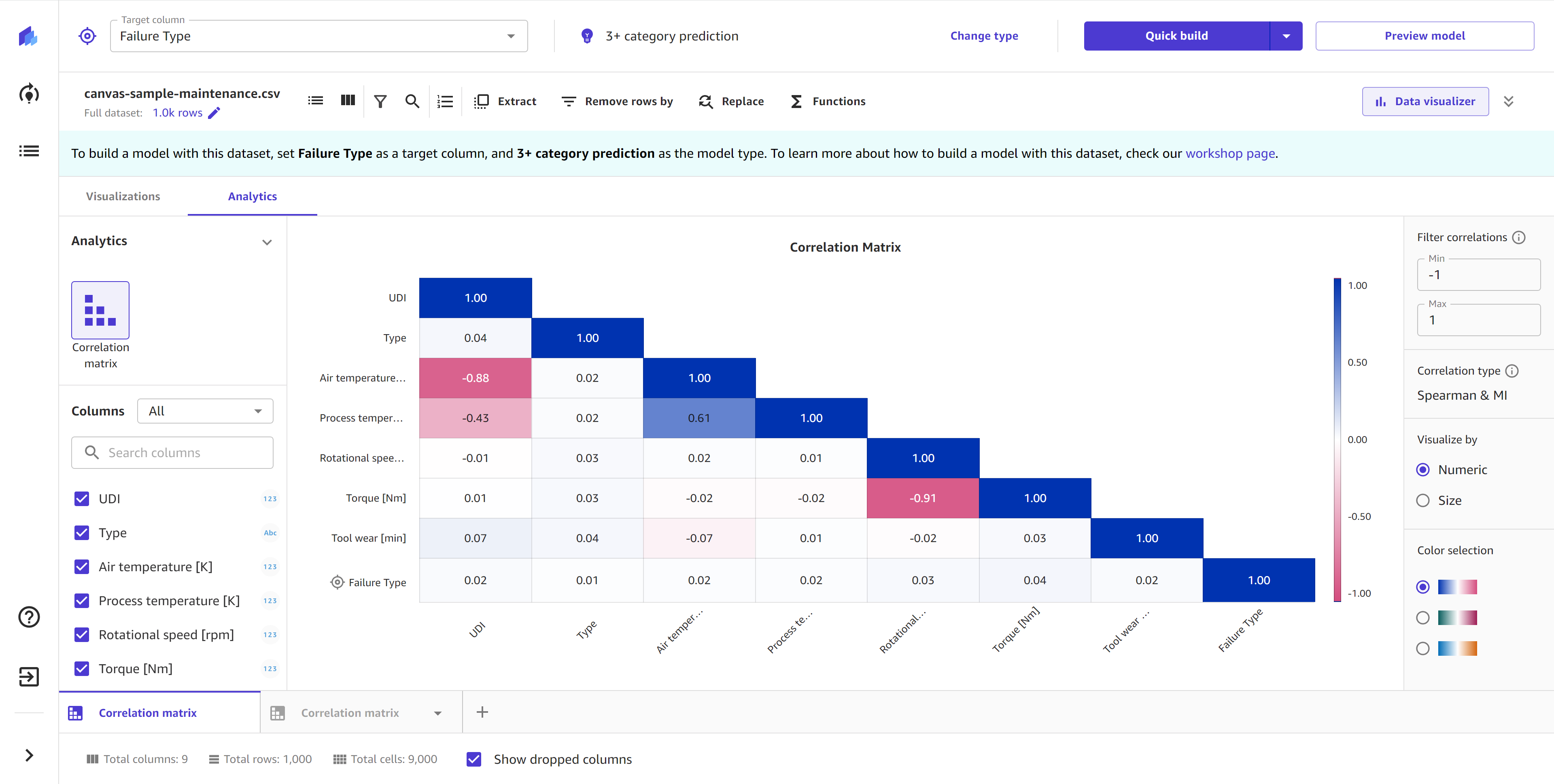
You should see a visualization similar to the following screenshot, which shows up to 15 columns of the dataset organized into a correlation matrix.
After you’ve created the correlation matrix, you can customize it by doing the following:
1. Choose your columns
For Columns, you can select the columns that you want to include in the matrix. You can compare up to 15 columns from your dataset.
Note
You can use numeric, categorical, or binary column types for a correlation matrix. The correlation matrix doesn’t support datetime or text data column types.
To add or remove columns from the correlation matrix, select and deselect columns from the Columns panel. You can also drag and drop columns from the panel directly onto the matrix. If your dataset has a lot of columns, you can search for the columns you want in the Search columns bar.
To filter the columns by data type, choose the dropdown list and select All, Numeric, or Categorical. Selecting All shows you all of the columns from your dataset, whereas the Numeric and Categorical filters only show you the numeric or categorical columns in your dataset. Note that binary column types are included in the numeric or categorical filters.
For the best data insights, include your target column in the correlation matrix. When you include your target column in the correlation matrix, it appears as the last feature on the matrix with a target symbol.
2. Choose your correlation type
SageMaker Canvas supports different correlation types, or methods for calculating the correlation between your columns.
To change the correlation type, use the Columns filter mentioned in the preceding section to filter for your desired column type and columns. You should see the Correlation type in the side panel. For numeric comparisons, you have the option to select either Pearson or Spearman. For categorical comparisons, the correlation type is set as MI. For categorical and mixed comparisons, the correlation type is set as Spearman & MI.
For matrices that only compare numeric columns, the correlation type is either Pearson or Spearman. The Pearson measure evaluates the linear relationship between two continuous variables. The Spearman measure evaluates the monotonic relationship between two variables. For both Pearson and Spearman, the scale of correlation ranges from -1 to 1, with either end of the scale indicating a perfect correlation (a direct 1:1 relationship) and 0 indicating no correlation. You might want to select Pearson if your data has more linear relationships (as revealed by a scatter plot visualization). If your data is not linear, or contains a mixture of linear and monotonic relationships, then you might want to select Spearman.
For matrices that only compare categorical columns, the correlation type is set to Mutual Information Classification (MI). The MI value is a measure of the mutual dependence between two random variables. The MI measure is on a scale of 0 to 1, with 0 indicating no correlation and 1 indicating a perfect correlation.
For matrices that compare a mix of numeric and categorical columns, the correlation type Spearman & MI is a combination of the Spearman and MI correlation types. For correlations between two numeric columns, the matrix shows the Spearman value. For correlations between a numeric and categorical column or two categorical columns, the matrix shows the MI value.
Lastly, remember that correlation does not necessarily indicate causation. A strong correlation value only indicates that there is a relationship between two variables, but the variables might not have a causal relationship. Carefully review your columns of interest to avoid bias when building your model.
3. Filter your correlations
In the side panel, you can use the Filter correlations feature to filter for the range of correlation values that you want to include in the matrix. For example, if you want to filter for features that only have positive or neutral correlation, you can set the Min to 0 and the Max to 1 (valid values are -1 to 1).
For Spearman and Pearson comparisons, you can set the Filter correlations range anywhere from -1 to 1, with 0 meaning that there is no correlation. -1 and 1 mean that the variables have a strong negative or positive correlation, respectively.
For MI comparisons, the correlation range only goes from 0 to 1, with 0 meaning that there is no correlation and 1 meaning that the variables have a strong correlation, either positive or negative.
Each feature has a perfect correlation (1) with itself. Therefore, you might notice that the top row of the correlation matrix is always 1. If you want to exclude these values, you can use the filter to set the Max less than 1.
Keep in mind that if your matrix compares a mix of numeric and categorical columns and uses the Spearman & MI correlation type, then the categorical x numeric and categorical x categorical correlations (which use the MI measure) are on a scale of 0 to 1, whereas the numeric x numeric correlations (which use the Spearman measure) are on a scale of -1 to 1. Review your correlations of interest carefully to ensure that you know the correlation type being used to calculate each value.
4. Choose the visualization method
In the side panel, you can use Visualize by to change the visualization method of the matrix. Choose the Numeric visualization method to show the correlation (Pearson, Spearman, or MI) value, or choose the Size visualization method to visualize the correlation with differently sized and colored dots. If you choose Size, you can hover over a specific dot on the matrix to see the actual correlation value.
5. Choose a color palette
In the side panel, you can use Color selection to change the color palette used for the scale of negative to positive correlation in the matrix. Select one of the alternative color palettes to change the colors used in the matrix.
