Amazon Connect Contact Lens conversational analytics dashboard
When Contact Lens conversational analytics is enabled on your contacts, you can analyze conversations between customers and agents by using speech and chat transcriptions, natural language processing, and intelligent search capabilities. Contact Lens conversational analytics performs sentiment analysis, detects issues, and enables you to automatically categorize contacts.
The Contact Lens conversational analytics dashboard helps you understand:
-
Why customers are contacting your contact center
-
The trends of contact drivers over time
-
The performance of each of those call drivers (for example, average handle time for call driver "Where’s my stuff?")
You can view key metrics for categories such as contacts handled and average handle time compared to a custom-defined benchmark time-range with color indicators (for example, green = good, red = bad) for quick insights within seconds (for example, "Am I performing better or worse than last week and by how much?") using the summary widgets at the top.
Data visualizations such as Movers and shakers display the largest changes compared to a custom-defined benchmark time period in the past (that is, week over week). While Contacts handled and average handle time trend shows you the number of contacts handled alongside the average handle time over a period of intervals in time in a time series chart.
Contents
Enable access to the dashboard
-
Ensure users are assigned the appropriate security profile permissions:
-
Access metrics - Access permission or the Dashboard - Access permission. For information about the difference in behavior, see Assign permissions to view dashboards and reports in Amazon Connect.
-
Contact Lens - conversational analytics: This permission enables users to view data in the Contact Lens dashboard.
-
-
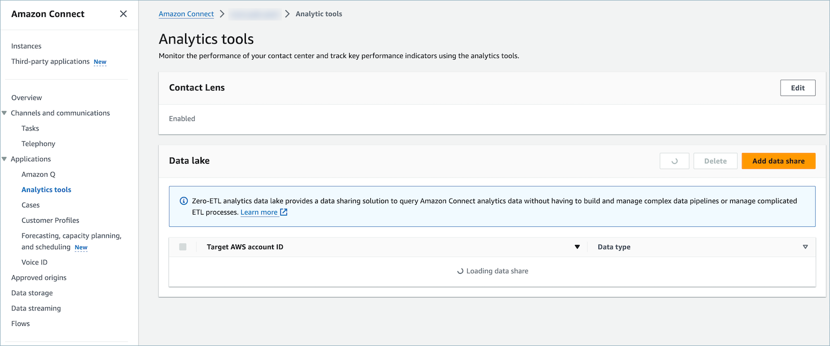
In the AWS console, ensure that Analytics tools, Enable Contact Lens is selected, as shown in the following image.
-
In your flow, enable Contact Lens conversational analytics so it analyzes your contacts. For instructions, see Enable call recording and speech analytics.
Performance overview charts
There are two performance overview charts that provide aggregated metrics based on your filters. The second chart is further filtered only by contacts analyzed by Contact Lens conversational analytics. Each metric within the charts is compared to your "compare to" benchmark time range filter.
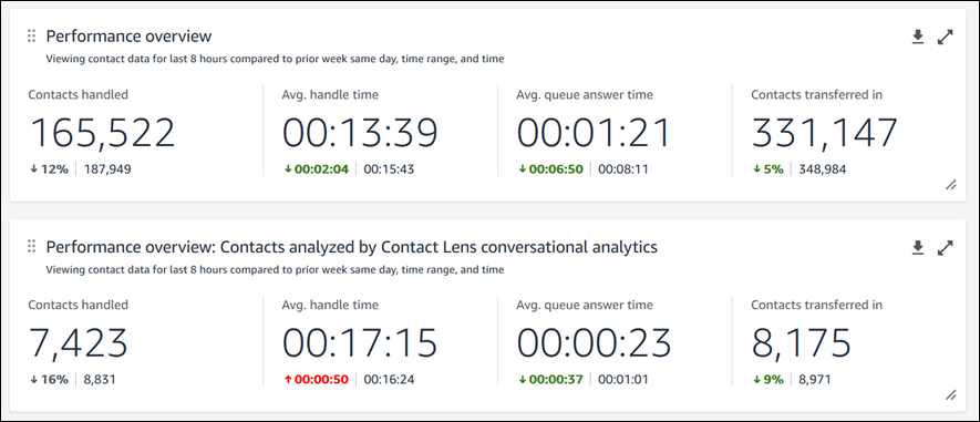
This chart shows the following information:
-
Contacts handled during your time range selection was 165,522, which is down ˜12% compared to your benchmark number of contacts handled, 187,949 contacts.
-
The percentages are rounded up or down.
-
The colors that appear for the metrics indicate positive (green) or negative (red) compared to your benchmark.
-
There are no colors for contacts handled.
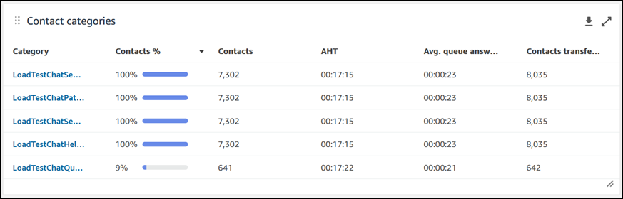
Contact categories
The contact categories chart shows you Contact Category information. To see all data, click on the pop-out icon in the top right of the chart. To deep dive further into the contacts, click on the Contact Category and it will take you to Contact Search pre-filtered for that category along with the dashboard filters.
-
Contacts %: the count of contacts analyzed by Contact Lens conversational analytics that have a given category divided by the total number of contacts analyzed by Contact Lens conversational analytics.
-
Contacts: count of contacts analyzed by Contact Lens conversational analytics that have a given category.
-
AHT: the average handle time for the contacts that have a given category.
-
Avg. queue answer time: the average queue answer time for the contacts that have a given category.
-
Contacts transferred in: the count of contacts transferred in for the contacts that have a given category.
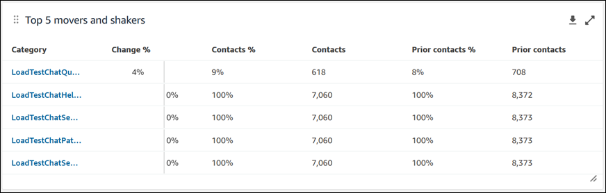
Movers and shakers
The movers and shakers chart shows you the categories with the highest percent change in distribution compared to your benchmark time range. In other words, it shows you the count of categories that were generated more or less frequently compared to the total number of contacts analyzed by Contact Lens conversational analytics.
For example:
-
If 20 out of 100 contacts analyzed by conversational analytics have Category A, your contacts % for Category A was 20%.
-
If during the comparison benchmark time period 10 out of 100 contacts analyzed by Contact Lens conversational analytics had Category A, your Prior contacts % for Category A was 10%.
-
The % Change would be (20% - 10%)/(10%) = 100%.
To see all data, choose the pop-out icon in the top right of the chart. To deep dive further into the contacts, choose the Contact Category and it will take you to Contact Search pre-filtered for that category along with the dashboard filters.
-
Change %: (Contacts % – Prior contacts %) / (Prior contacts %). This number is rounded. The chart is sorted by highest absolute Change %.
-
Contacts %: the count of contacts analyzed by Contact Lens conversational analytics in the time range specified in your dashboard filter that have a given category divided by the total number of contacts analyzed by Contact Lens conversational analytics.
-
Contacts: the count of contacts analyzed by Contact Lens conversational analytics in the time range specified in your dashboard filter.
-
Prior contacts %: the count of contacts analyzed by Contact Lens conversational analytics in the "compare to" benchmark time range specified in your dashboard filter that have a given category divided by the total number of contacts analyzed by Contact Lens conversational analytics.
-
Prior contacts: the count of contacts analyzed by Contact Lens conversational analytics in the "compare to" benchmark time range specified in your dashboard filter.
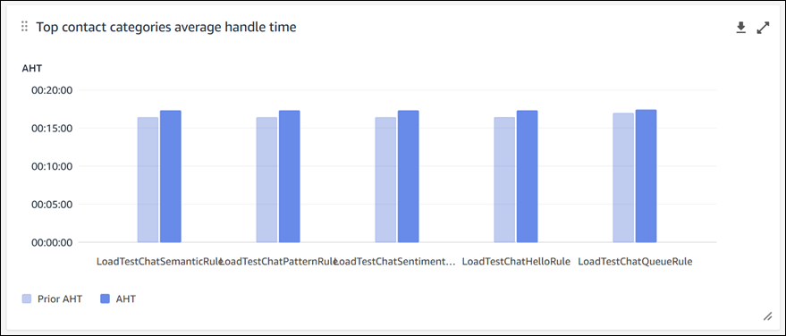
Top contact categories average handle time
The top contact categories average handle time displays the prior AHT (using the "compare to" benchmark time range) to the current time range AHT for each of your top 10 categories (sorted by count of contacts with a category from left to right). To see all data, click on the pop-out icon in the top right of the chart.
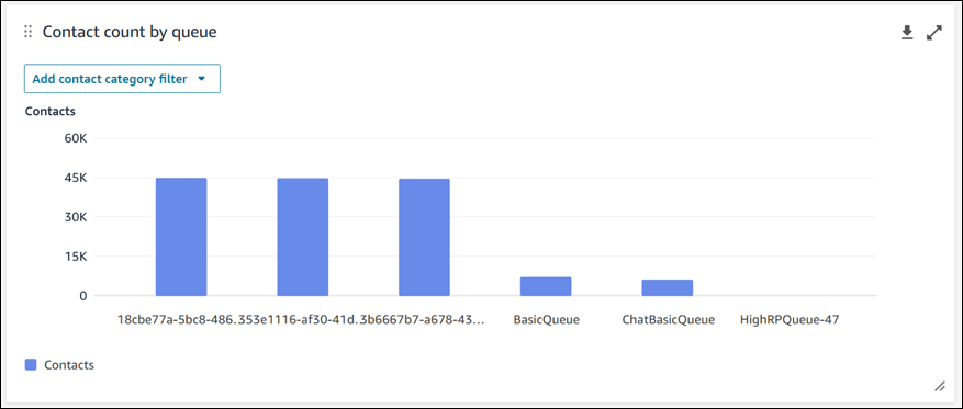
Contact count by queue
Note
This section of the dashboard displays data even when Contact Lens conversational analytics is not enabled on any contacts.
The contact count by queue chart displays the count of contacts for each queue, sorted by the highest number of contacts from left to right. You can configure this widget further by filtering for contact categories directly from this chart. This filter overrides the page-level contact category filter at the top of the dashboard.
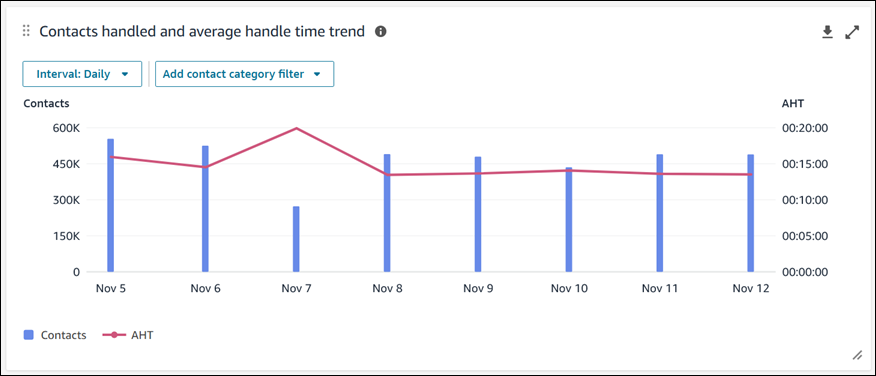
Contacts handled and average handle time trend
Note
This section of the dashboard displays data even when Contact Lens conversational analytics is not enabled on any contacts.
The Contacts handled and average handle time trend is a time-series chart that displays the count of contacts handled (blue bars) and the average handle time (red line) over a given time period broken down by intervals (15min, daily, weekly, monthly). You can configure different time range intervals by using the "Interval" button directly in the widget. The intervals that you may select depend on the page-level time range filter.
For example:
-
If you have a "Today" time range filter at the top of your dashboard, you can only see an interval of 15min for the last 24 hours.
-
If you have a "Day" time range filter at the top of your dashboard, you can see a trailing 8 day interval trend, or a 15min interval trend for the trailing 24 hours.
Dashboard functionality limitations
The following limitations apply to the Contact Lens conversational analytics dashboard:
-
Tag-based access controls are not supported on the dashboard.
-
If you have a routing profile or agent hierarchy filter selected, the hyperlinks on contact categories leading to contact search will be disabled within the Contact categories and Movers and Shakers charts.
