RANDOM_CUT_FOREST_WITH_EXPLANATION
Computes an anomaly score and explains it for each record in your data stream. The anomaly score for a record indicates how different it is from the trends that have recently been observed for your stream. The function also returns an attribution score for each column in a record, based on how anomalous the data in that column is. For each record, the sum of the attribution scores of all columns is equal to the anomaly score.
You also have the option of getting information about the direction in which a given column is anomalous (whether it's high or low relative to the recently observed data trends for that column in the stream).
For example, in e-commerce applications, you might want to know when there's a change in the recently observed pattern of transactions. You also might want to know how much of the change is due to a change in the number of purchases made per hour, and how much is due to a change in the number of carts abandoned per hour—information that is represented by the attribution scores. You also might want to look at directionality to know whether you're being notified of the change due to an increase or a decrease in each of those values.
Note
The RANDOM_CUT_FOREST_WITH_EXPLANATION function's ability to detect anomalies
is application-dependent. Casting your business problem so that it can be solved with this
function requires domain expertise. For example, you may need to determine which combination
of columns in your input stream to pass to the function, and you may potentially benefit from
normalizing the data. For more information, see inputStream.
A stream record can have non-numeric columns, but the function uses only numeric columns to assign an anomaly score. A record can have one or more numeric columns. The algorithm uses all the numeric data in computing an anomaly score.
The algorithm starts developing the machine learning model using current records in the stream when you start the application. The algorithm does not use older records in the stream for machine learning, nor does it use statistics from previous executions of the application.
The algorithm accepts the DOUBLE, INTEGER, FLOAT,
TINYINT, SMALLINT, REAL, and BIGINT data
types.
Note
DECIMAL is not a supported type. Use DOUBLE instead.
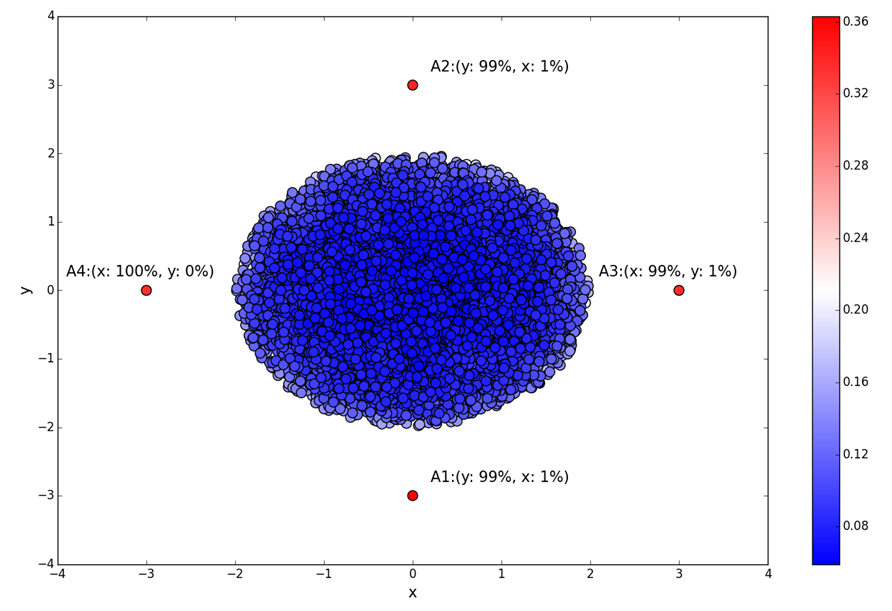
The following is a simple visual example of anomaly detection with different attribution scores in two-dimensional space. The diagram shows a cluster of blue data points and four outliers shown as red points. The red points have similar anomaly scores, but these four points are anomalous for different reasons. For points A1 and A2, most of the anomaly is attributable to their outlying y-values. In the case of A3 and A4, you can attribute most of the anomaly to their outlying x-values. Directionality is LOW for the y-value of A1, HIGH for the y-value of A2, HIGH for the x-value of A3, and LOW for the x-value of A4.
Syntax
RANDOM_CUT_FOREST_WITH_EXPLANATION (inputStream,
                   numberOfTrees,
                   subSampleSize,
                   timeDecay,
                   shingleSize,
                   withDirectionality
)
Parameters
The following sections describe the parameters of the
RANDOM_CUT_FOREST_WITH_EXPLANATION function.
inputStream
Pointer to your input stream. You set a pointer using the CURSOR function.
For example, the following statements set a pointer to InputStream.
CURSOR(SELECT STREAM * FROM InputStream)
CURSOR(SELECT STREAM IntegerColumnX, IntegerColumnY FROM InputStream)
-– Perhaps normalize the column X value.
CURSOR(SELECT STREAM IntegerColumnX / 100, IntegerColumnY FROM InputStream)
–- Combine columns before passing to the function.
CURSOR(SELECT STREAM IntegerColumnX - IntegerColumnY FROM InputStream)
The CURSOR function is the only required parameter for the
RANDOM_CUT_FOREST_WITH_EXPLANATION function. The function assumes the
following default values for the other parameters:
numberOfTrees = 100
subSampleSize = 256
timeDecay = 100,000
shingleSize = 1
withDirectionality = FALSE
When you use this function, your input stream can have up to 30 numeric columns.
numberOfTrees
Using this parameter, you specify the number of random cut trees in the forest.
Note
By default, the algorithm constructs a number of trees, each constructed using a given
number of sample records (see subSampleSize later in this list) from the
input stream. The algorithm uses each tree to assign an anomaly score. The average of all
these scores is the final anomaly score.
The default value for numberOfTrees is 100. You can set this value between
1 and 1,000 (inclusive). By increasing the number of trees in the forest, you can get a
better estimate of the anomaly and attribution scores, but this also increases the running
time.
subSampleSize
Using this parameter, you can specify the size of the random sample that you want the
algorithm to use when constructing each tree. Each tree in the forest is constructed with a
(different) random sample of records. The algorithm uses each tree to assign an anomaly
score. When the sample reaches subSampleSize records, records are removed
randomly, with older records having a higher probability of removal than newer records.
The default value for subSampleSize is 256. You can set this value between
10 and 1,000 (inclusive).
The subSampleSize must be less than the timeDecay parameter
(which is set to 100,000 by default). Increasing the sample size provides each tree a larger
view of the data, but it also increases the running time.
Note
The algorithm returns zero for the first subSampleSize records while the
machine learning model is trained.
timeDecay
You can use the timeDecay parameter to specify how much of the recent past
to consider when computing an anomaly score. Data streams naturally evolve over time. For
example, an e-commerce website’s revenue might continuously increase, or global temperatures
might rise over time. In such situations, you want an anomaly to be flagged relative to
recent data, as opposed to data from the distant past.
The default value is 100,000 records (or 100,000 shingles if shingling is used, as described in the following section). You can set this value between 1 and the maximum integer (that is, 2147483647). The algorithm exponentially decays the importance of older data.
If you choose the timeDecay default of 100,000, the anomaly detection
algorithm does the following:
-
Uses only the most recent 100,000 records in the calculations (and ignores older records).
-
Within the most recent 100,000 records, assigns exponentially more weight to recent records and less to older records in anomaly detection calculations.
The timeDecay parameter determines the maximum quantity of recent records
kept in the working set of the anomaly detection algorithm. Smaller timeDecay
values are desirable if the data is changing rapidly. The best timeDecay value
is application-dependent.
shingleSize
The explanation given here applies to a one-dimensional stream (that is, a stream with one numeric column), but shingling can also be used for multi-dimensional streams.
A shingle is a consecutive sequence of the most recent records. For example, a
shingleSize of 10 at time t corresponds to a vector of
the last 10 records received up to and including time t. The algorithm
treats this sequence as a vector over the last shingleSize number of records.
If data is arriving uniformly in time, a shingle of size 10 at time t corresponds to the data received at time t-9, t-8,…,t. At time t+1, the shingle slides over one unit and consists of data from time t-8,t-7, …, t, t+1. These shingled records gathered over time correspond to a collection of 10-dimensional vectors over which the anomaly detection algorithm runs.
The intuition is that a shingle captures the shape of the recent past. Your data might have a typical shape. For example, if your data is collected hourly, a shingle of size 24 might capture the daily rhythm of your data.
The default shingleSize is one record (because shingle size is
data-dependent). You can set this value between 1 and 30 (inclusive).
Note the following about setting the shingleSize:
-
If you set the
shingleSizetoo small, the algorithm is more susceptible to minor fluctuations in the data, leading to high anomaly scores for records that are not anomalous. -
If you set the
shingleSizetoo large, it might take more time to detect anomalous records because there are more records in the shingle that are not anomalous. It also might take more time to determine that the anomaly has ended. -
Identifying the right shingle size is application-dependent. Experiment with different shingle sizes to determine the effects.
withDirectionality
A Boolean parameter that defaults to false. When set to true,
it tells you the direction in which each individual dimension makes a contribution to the
anomaly score. It also provides the strength of the recommendation for that
directionality.
Results
The function returns an anomaly score of 0 or more and an explanation in JSON format.
The anomaly score starts out at 0 for all the records in the stream while the algorithm goes through the learning phase. You then start to see positive values for the anomaly score. Not all positive anomaly scores are significant; only the highest ones are. To get a better understanding of the results, look at the explanation.
The explanation provides the following values for each column in the record:
-
Attribution score: A nonnegative number that indicates how much this column has contributed to the anomaly score of the record. In other words, it indicates how different the value of this column is from what’s expected based on the recently observed trend. The sum of the attribution scores of all columns for the record is equal to the anomaly score.
-
Strength: A nonnegative number representing the strength of the directional recommendation. A high value for strength indicates a high confidence in the directionality that is returned by the function. During the learning phase, the strength is 0.
-
Directionality: This is either HIGH if the value of the column is above the recently observed trend or LOW if it’s below the trend. During the learning phase, this defaults to LOW.
Note
The trends that machine learning functions use to determine analysis scores are infrequently reset when the Kinesis Data Analytics service performs service maintenance. You might unexpectedly see analysis scores of 0 after service maintenance occurs. We recommend you set up filters or other mechanisms to treat these values appropriately as they occur.
Examples
Stock Ticker Data Example
This example is based on the sample stock dataset that is part of the Getting Started Exercise in the Amazon Kinesis Analytics Developer Guide. To run the example, you need a Kinesis Data Analytics application that has the sample stock ticker input stream. To learn how to create a Kinesis Data Analytics application and configure the sample stock ticker input stream, see Getting Started in the Amazon Kinesis Analytics Developer Guide.
The sample stock dataset has the following schema:
(ticker_symbol  VARCHAR(4),
sector          VARCHAR(16),
change          REAL,
price           REAL)
In this example, the application calculates an anomaly score for the record and an
attribution score for the PRICE and CHANGE columns, which are the
only numeric columns in the input stream.
CREATE OR REPLACE STREAM "DESTINATION_SQL_STREAM" (anomaly REAL, ANOMALY_EXPLANATION VARCHAR(20480));
CREATE OR REPLACE PUMP "STREAM_PUMP" AS INSERT INTO "DESTINATION_SQL_STREAM"
SELECT "ANOMALY_SCORE", "ANOMALY_EXPLANATION" FROM TABLE (RANDOM_CUT_FOREST_WITH_EXPLANATION(CURSOR(SELECT STREAM * FROM "SOURCE_SQL_STREAM_001"), 100, 256, 100000, 1, true)) WHERE ANOMALY_SCORE > 0
The preceding example outputs a stream similar to the following.

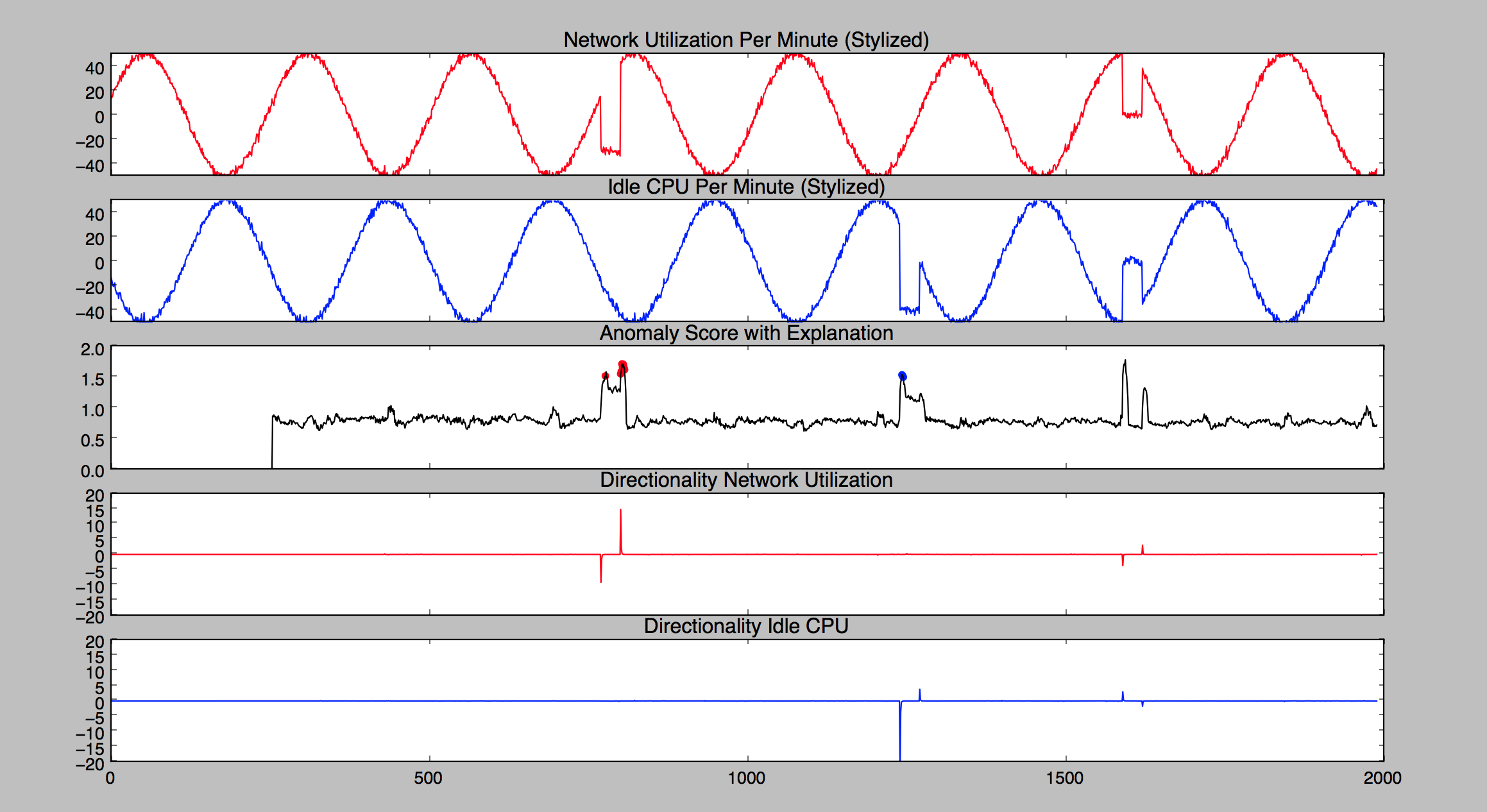
Network and CPU Utilization Example
This theoretical example shows two sets of data that follow an oscillating pattern. In the following graph, they're represented by the red and blue curves at the top. The red curve shows network utilization over time, and the blue curve shows idle CPU over time for the same computer system. The two signals, which are out of phase with each other, are regular most of the time. But they both also show occasional anomalies, which appear as irregularities in the graph. The following is an explanation of what the curves in the graph represent from the top curve to the bottom curve.
The top curve, which is red, represents network utilization over time. It follows a cyclical pattern and is regular most of the time, except for two anomalous periods, each representing a drop in utilization. The first anomalous period occurs between time values 500 and 1,000. The second anomalous period occurs between time values 1,500 and 2,000.
The second curve from the top (blue in color) is idle CPU over time. It follows a cyclical pattern and is regular most of the time, with the exception of two anomalous periods. The first anomalous period occurs between time values 1,000 and 1,500 and shows a drop in idle CPU time. The second anomalous period occurs between time values 1,500 and 2,000 and shows an increase in idle CPU time.
The third curve from the top shows the anomaly score. At the beginning, there's a learning phase during which the anomaly score is 0. After the learning phase, there's steady noise in the curve, but the anomalies stand out.
The first anomaly, which is marked in red on the black anomaly score curve, is more attributable to the network utilization data. The second anomaly, marked in blue, is more attributable to the CPU data. The red and blue markings are provided in this graph as a visual aide. They aren't produced by the
RANDOM_CUT_FOREST_WITH_EXPLANATIONfunction. Here's how we obtained these red and blue markings:After running the function, we selected the top 20 anomaly score values.
From this set of top 20 anomaly score values, we selected those values for which the network utilization had an attribution greater than or equal to 1.5 times the attribution for CPU. We colored the points in this new set with red markers in the graph.
-
We colored with blue markers the points for which the CPU attribution score was greater than or equal to 1.5 times the attribution for network utilization.
The second curve from the bottom is a graphical representation of directionality for the network utilization signal. We obtained this curve by running the function, multiplying the strength by -1 for LOW directionality and by +1 for HIGH directionality, and plotting the results against time.
When there's a drop in the cyclical pattern of network utilization, there’s a corresponding negative spike in directionality. When network utilization shows an increase back to the regular pattern, directionality shows a positive spike corresponding to that increase. Later on, there's another negative spike, followed closely by another positive spike. Together they represent the second anomaly seen in the network utilization curve.
The bottom curve is a graphical representation of directionality for the CPU signal. We obtained it by multiplying the strength by -1 for LOW directionality and by +1 for HIGH directionality, and then plotting the results against time.
With the first anomaly in the idle CPU curve, this directionality curve shows a negative spike followed immediately by a smaller, positive spike. The second anomaly in the idle CPU curve produces a positive spike followed by a negative spike in directionality.
Blood Pressure Example
For a more detailed example, with code that detects and explains anomalies in blood pressure readings, see Example: Detecting Data Anomalies and Getting an Explanation.
