Evaluate your model's performance
Amazon SageMaker Canvas provides overview and scoring information for the different types of model. Your model’s score can help you determine how accurate your model is when it makes predictions. The additional scoring insights can help you quantify the differences between the actual and predicted values.
To view the analysis of your model, do the following:
-
Open the SageMaker Canvas application.
-
In the left navigation pane, choose My models.
-
Choose the model that you built.
-
In the top navigation pane, choose the Analyze tab.
-
Within the Analyze tab, you can view the overview and scoring information for your model.
The following sections describe how to interpret the scoring for each model type.
Evaluate categorical prediction models
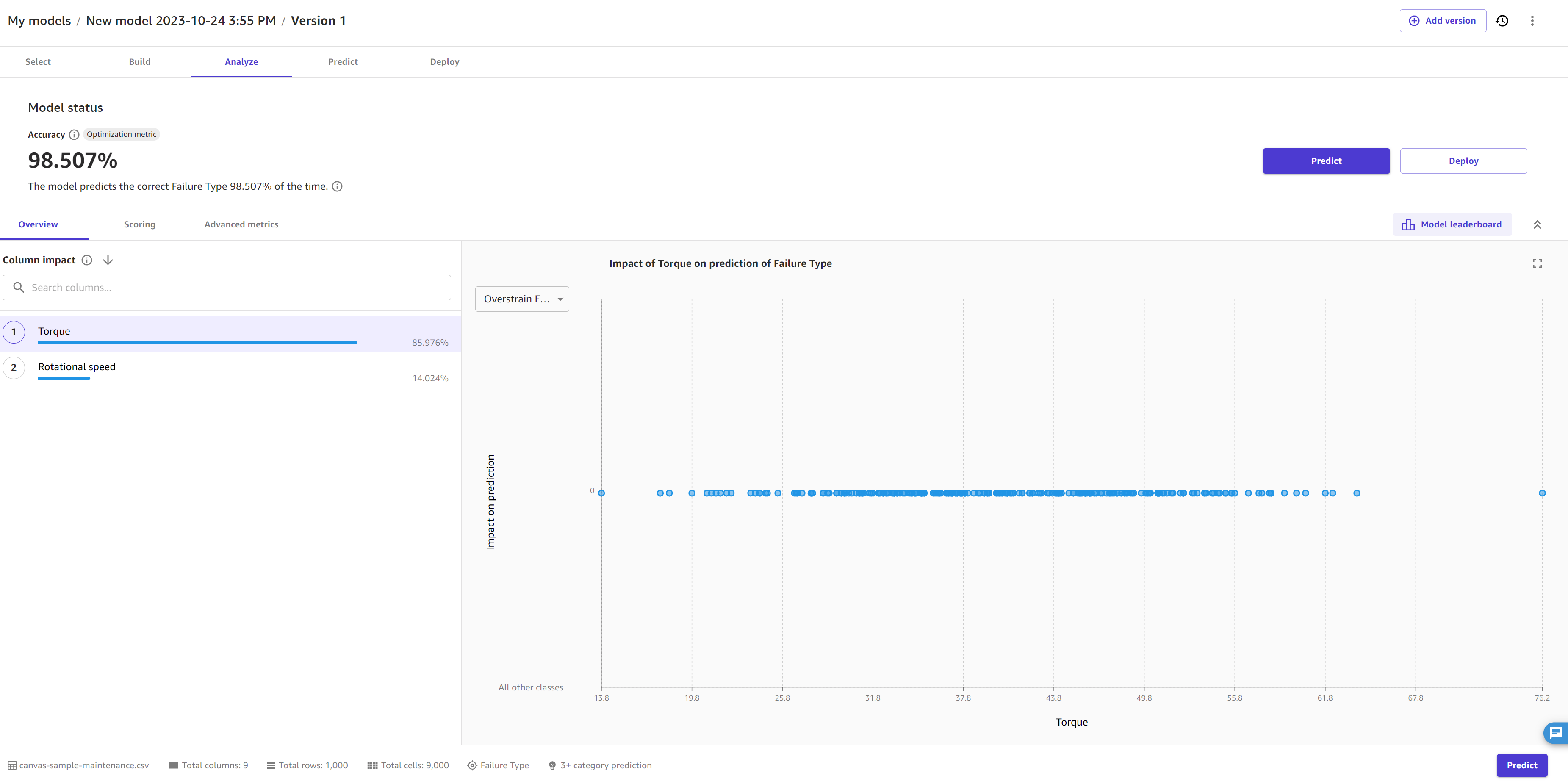
The Overview tab shows you the column impact for each column. Column impact is a percentage score that indicates how much weight a column has in making predictions in relation to the other columns. For a column impact of 25%, Canvas weighs the prediction as 25% for the column and 75% for the other columns.
The following screenshot shows the Accuracy score for the model, along with the Optimization metric, which is the metric that you choose to optimize when building the model. In this case, the Optimization metric is Accuracy. You can specify a different optimization metric if you build a new version of your model.
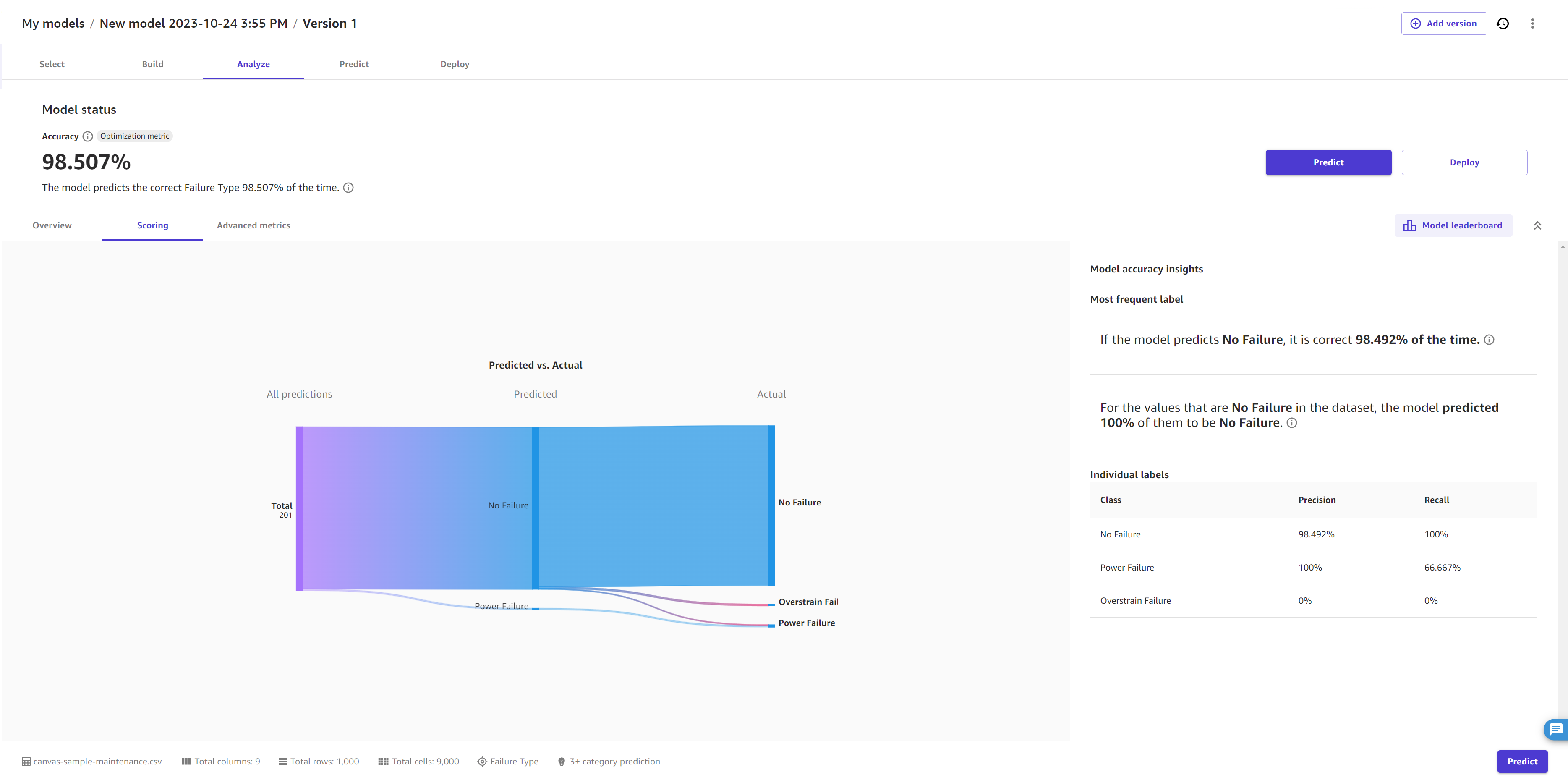
The Scoring tab for a categorical prediction model gives you the ability to visualize all the predictions. Line segments extend from the left of the page, indicating all the predictions the model has made. In the middle of the page, the line segments converge on a perpendicular segment to indicate the proportion of each prediction to a single category. From the predicted category, the segments branch out to the actual category. You can get a visual sense of how accurate the predictions were by following each line segment from the predicted category to the actual category.
The following image gives you an example Scoring section for a 3+ category prediction model.
You can also view the Advanced metrics tab for more detailed information about your model’s performance, such as the advanced metrics, error density plots, or confusion matrices. To learn more about the Advanced metrics tab, see Use advanced metrics in your analyses.
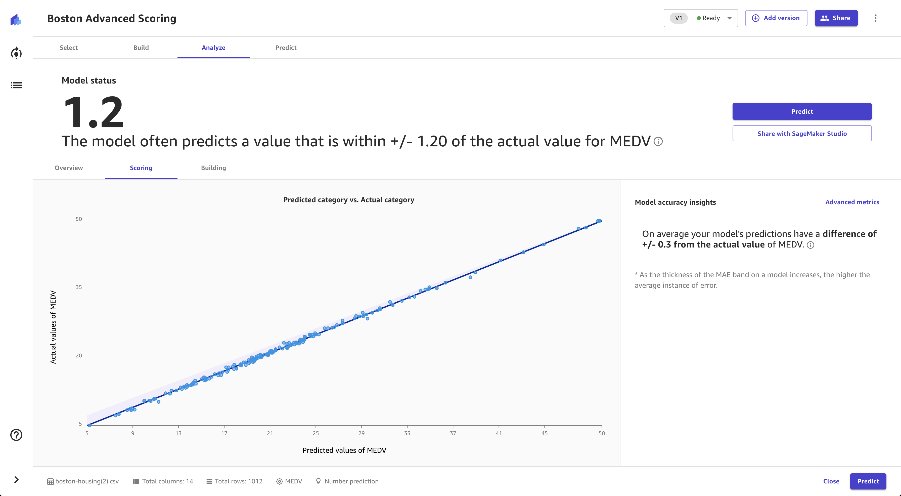
Evaluate numeric prediction models
The Overview tab shows you the column impact for each column. Column impact is a percentage score that indicates how much weight a column has in making predictions in relation to the other columns. For a column impact of 25%, Canvas weighs the prediction as 25% for the column and 75% for the other columns.
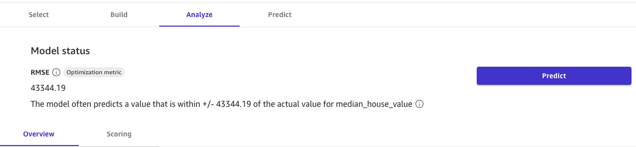
The following screenshot shows the RMSE score for the model on the Overview tab, which in this case is the Optimization metric. The Optimization metric is the metric that you choose to optimize when building the model. You can specify a different optimization metric if you build a new version of your model.
The Scoring tab for numeric prediction shows a line to indicate the model's predicted value in relation to the data used to make predictions. The values of the numeric prediction are often +/- the RMSE (root mean squared error) value. The value that the model predicts is often within the range of the RMSE. The width of the purple band around the line indicates the RMSE range. The predicted values often fall within the range.
The following image shows the Scoring section for numeric prediction.
You can also view the Advanced metrics tab for more detailed information about your model’s performance, such as the advanced metrics, error density plots, or confusion matrices. To learn more about the Advanced metrics tab, see Use advanced metrics in your analyses.
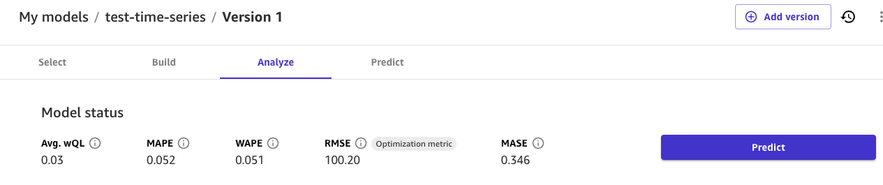
Evaluate time series forecasting models
On the Analyze page for time series forecasting models, you can see an overview of the model’s metrics. You can hover over each metric for more information, or you can see Use advanced metrics in your analyses for more information about each metric.
In the Column impact section, you can see the score for each column. Column impact is a percentage score that indicates how much weight a column has in making predictions in relation to the other columns. For a column impact of 25%, Canvas weighs the prediction as 25% for the column and 75% for the other columns.
The following screenshot shows the time series metrics scores for the model, along with the Optimization metric, which is the metric that you choose to optimize when building the model. In this case, the Optimization metric is RMSE. You can specify a different optimization metric if you build a new version of your model. These metrics scores are taken from your backtest results, which are available for download in the Artifacts tab.
The Artifacts tab provides access to several key resources that you can use to dive deeper into your model’s performance and continue iterating upon it:
-
Shuffled training and validation splits – This section includes links to the artifacts generated when your dataset was split into training and validation sets, enabling you to review the data distribution and potential biases.
-
Backtest results – This section includes a link to the forecasted values for your validation dataset, which is used to generate accuracy metrics and evaluation data for your model.
-
Accuracy metrics – This section lists the advanced metrics that evaluate your model's performance, such as Root Mean Squared Error (RMSE). For more information about each metric, see Metrics for time series forecasts.
-
Explainability report – This section provides a link to download the explainability report, which offers insights into the model's decision-making process and the relative importance of input columns. This report can help you identify potential areas for improvement.
On the Analyze page, you can also choose the Download button to directly download the backtest results, accuracy metrics, and explainability report artifacts to your local machine.
Evaluate image prediction models
The Overview tab shows you the Per label performance, which gives you an overall accuracy score for the images predicted for each label. You can choose a label to see more specific details, such as the Correctly predicted and Incorrectly predicted images for the label.
You can turn on the Heatmap toggle to see a heatmap for each image. The heatmap shows you the areas of interest that have the most impact when your model is making predictions. For more information about heatmaps and how to use them to improve your model, choose the More info icon next to the Heatmap toggle.
The Scoring tab for single-label image prediction models shows you a comparison of what the model predicted as the label versus what the actual label was. You can select up to 10 labels at a time. You can change the labels in the visualization by choosing the labels dropdown menu and selecting or deselecting labels.
You can also view insights for individual labels or groups of labels, such as the three labels with the highest or lowest accuracy, by choosing the View scores for dropdown menu in the Model accuracy insights section.
The following screenshot shows the Scoring information for a single-label image prediction model.
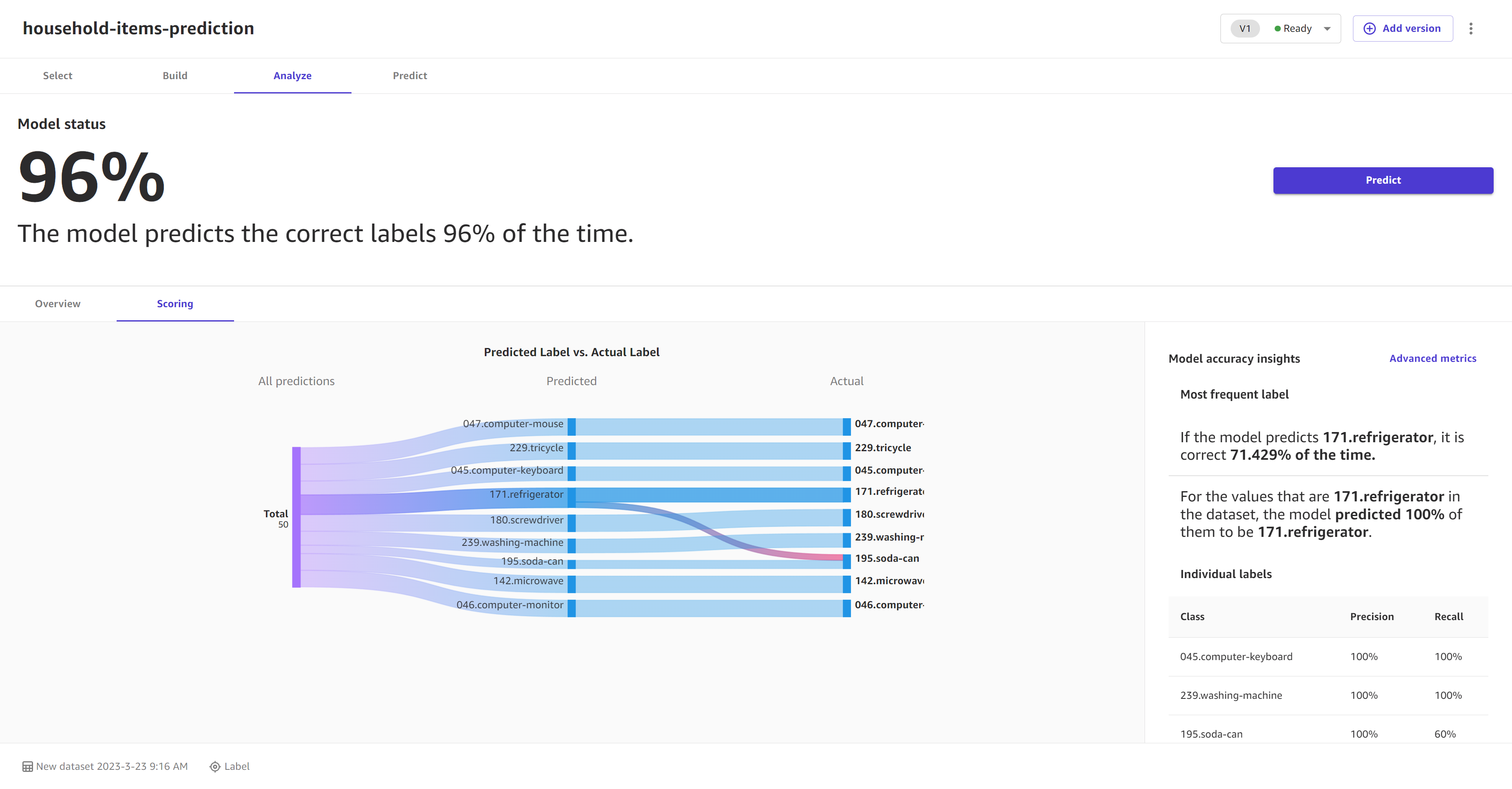
Evaluate text prediction models
The Overview tab shows you the Per label performance, which gives you an overall accuracy score for the passages of text predicted for each label. You can choose a label to see more specific details, such as the Correctly predicted and Incorrectly predicted passages for the label.
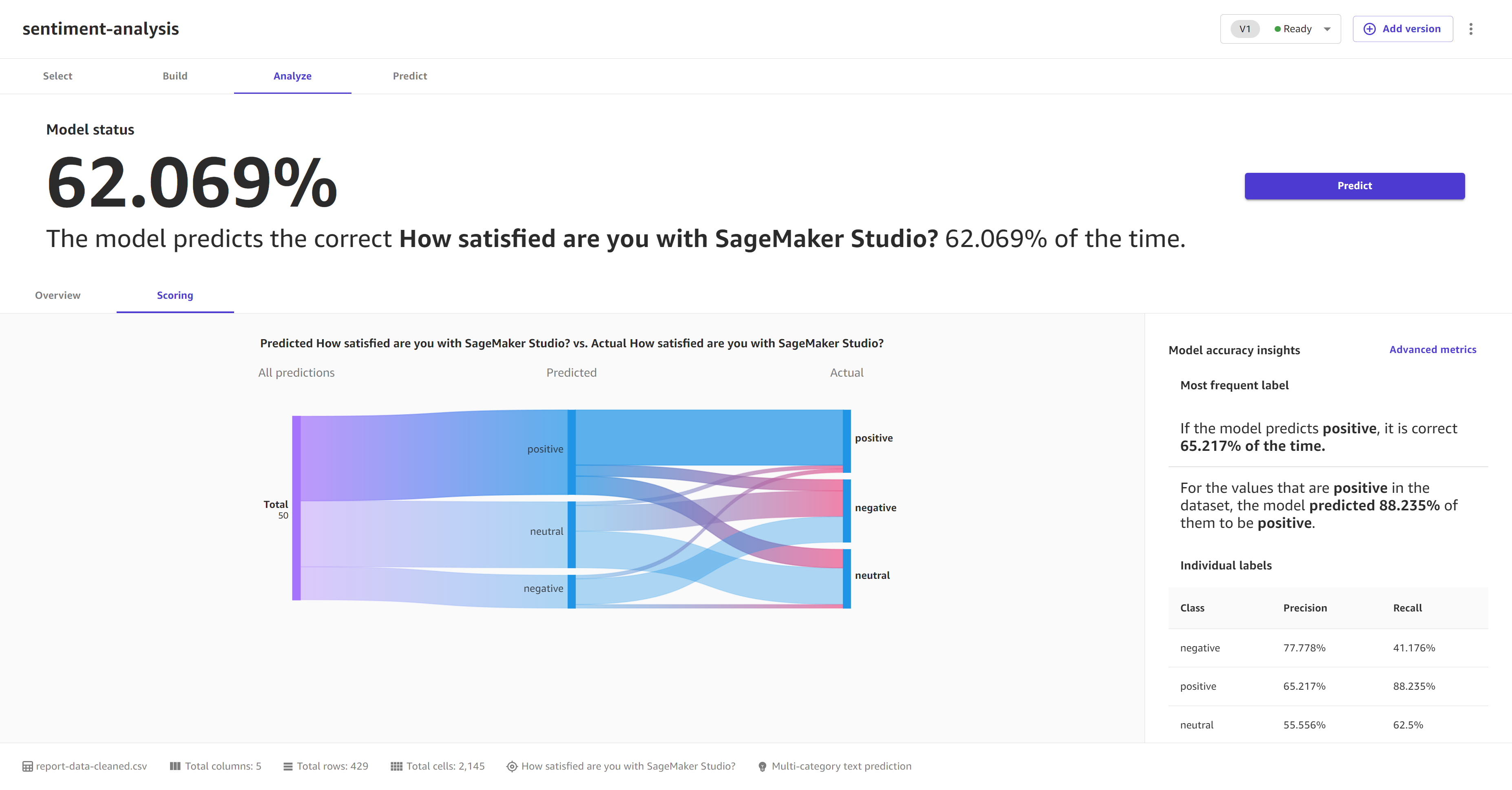
The Scoring tab for multi-category text prediction models shows you a comparison of what the model predicted as the label versus what the actual label was.
In the Model accuracy insights section, you can see the Most frequent category, which tells you the category that the model predicted most frequently and how accurate those predictions were. If you model predicts a label of Positive correctly 99% of the time, then you can be fairly confident that your model is good at predicting positive sentiment in text.
The following screenshot shows the Scoring information for a multi-category text prediction model.