Step 9: (Optional) Build a migration tracker dashboard
If you deployed the optional migration tracker component, you can set up an Amazon QuickSight dashboard that will visualize the migration metadata stored in the Amazon DynamoDB table.
Use the following procedures to:
Note
If the Migration Factory is empty and there is no wave, application, and server data, then there will not be any data to build a QuickSight dashboard.
Set the QuickSight permission and connections
If you have not set up Amazon QuickSight in your AWS account, refer to Setting Up for Amazon QuickSight in the Amazon QuickSight User Guide. After you have set up a QuickSight subscription, use the following procedure to set the permissions and connections between QuickSight and this solution.
Note
This solution uses Amazon QuickSight enterprise license. However, if you don’t want the email reporting, insights, and the hourly data refresh, you can opt for a standard license, which can also be used with migration tracker.
First, connect QuickSight with the Amazon S3 bucket:
-
Navigate to the QuickSight console
. -
On the QuickSight page, choose the icon displaying a person in the upper-right corner and Manage QuickSight.
-
On the Account name page, from the left menu pane, select Security & permissions.
-
On the Security & permissions page, under the QuickSight access to*AWS services section, select *Manage.
-
From the QuickSight access to AWS services page, select the checkbox for Amazon S3.
-
On the Select Amazon S3 buckets dialog box, verify that you are in the S3 Buckets Linked to QuickSight Account tab and tick both the right and left checkboxes for the athena-results and *migration-tracker * S3 buckets.
QuickSight S3 bucket selection dialog with options for Athena Workgroup write permissions.

Note
If you are already using QuickSight for other S3 data analysis, clear and reselect the Amazon S3 option to display the bucket selection dialog box.
-
Choose Finish.
Next, set up permissions for Amazon Athena:
-
From the QuickSight access to AWS services page, tick the checkbox for Amazon Athena.
-
On the Amazon Athena permissions dialog box, choose Next.
-
On the Amazon Athena resources dialog box, verify that you are in the S3 Buckets Linked to QuickSight Account tab and verify that the same S3 buckets are checked - athena-results and migration-tracker.
QuickSight Amazon Athena resources dialog box

-
Choose Finish.
-
From the *QuickSight access to*AWS services page, choose Save.
Next, set up a new analysis:
-
Select the QuickSight logo to return to the QuickSight homepage.
-
On the Analysis page, choose New Analysis.
-
Choose New dataset.
-
On the Create a Data Set page, choose Athena.
-
In the New Athena data source dialog box, take the following actions:
-
In the Data source name field, enter a name for the data source
-
In the Athena workgroup field, select the appropriate
<migration-factory>-workgroup.Note
If you have deployed this solution multiple times, there will be more than one workgroup. Select the one that was created for your current deployment.
New Athena data source dialog box

-
-
Choose Validate connection to ensure that QuickSight can communicate with Athena.
-
After the connection is validated, choose Create data source.
-
In the next dialog box, Choose your table, take the following actions:
-
From the Catalog list, choose AwsDataCatalog.
-
From the Database list, choose
<Athena-table>-tracker. -
From the Tables list, choose
<tracker-name>-general-view. -
Choose Select.
Choose your table dialog box

-
-
In the next dialog box, Finish data set creation, choose Visualize.
Finish data set creation dialog box

-
In New sheet, choose Interactive sheet, then choose Create.
After the data is imported, you will be redirected to the Analysis page. However, before creating your visuals, set up a schedule to refresh your dataset.
-
Navigate to the QuickSight homepage.
-
In the navigation pane, choose Datasets.
-
On the Datasets page, select the
<migration-factory>-general-view dataset.QuickSight Datasets page

-
On the
<migration-factory>-general-view Datasets page, choose the Refresh tab.Migration tracker general view dialog box

-
Choose Add new schedule.
-
On the Create a refresh schedule page, select Full refresh, select the appropriate Time zone, enter a Start time, and select the Frequency.
-
Choose Save.
Create a schedule dialog box

Create a dashboard
Amazon QuickSight offers the flexibility of building a custom dashboard that helps you to visualize your migration metadata. The following tutorial creates a dashboard containing a count visual that shows the server count by waves and bar charts showing the migration status. You can customize this dashboard to meet your business needs.
Example QuickSight dashboard

Use the following steps to create a count overview by migration waves. This view counts all the servers in the dataset that are grouped per wave, providing a granular view of the total number of servers in a wave. To create this view, you will convert the server_name into a measure, which allows you to count distinct servers names. Then you will create a wave-by-wave filter.
-
Navigate to the QuickSight homepage.
-
In the navigation pane, choose Analyses.
-
Select
<migration-factory>-general-view. -
On the Visualize page, hover over the server_name and choose the ellipsis to the right.
QuickSight Visualize a data set page

-
Select Convert to measure to convert the dataset from a dimension to a measure. The server_name text turns green to indicate that the dataset has been converted to a measure.
-
Select server_name to visualize the image. The visual will contain an error message indicating that the field data types must be updated.
-
On the Visuals pane, select the server_name (Sum), under Value, select Aggregate: Sum, then select Count distinct.
Field wells page

A count of the number of unique server names you have in your dataset is displayed. You can resize the visualization as needed to ensure it displays the information clearly on your monitor.
Note
You may need to convert your dataset back to dimension when you create another visual.
Next, add filters to the visualization to identify the server count for each migration wave. The following steps will apply a wave_id filter to your visualization.
-
Verify that the visualization is selected. In the top navigation pane, select Filter.
-
From the left Filters pane, choose ADD and select wave_id from the list.
Filters pane drop-down list

-
Choose wave_id from the filters list.
-
In the Filter pane, under Search values select the checkbox next to the value 1.
-
Choose Apply.
-
In the visualization, change the title to Wave 1 Server Count by double clicking on the current title.
Repeat these steps for the other waves that are visualized in your dashboard.
The next visualization we will add in the dashboard is a doughnut graph showing servers that are in progress of being migrated versus ones that have completed the migration. This chart uses Super-fast, Parallel, In-memory Calculation Engine (SPICE) Queries by creating a new column in the dataset that determines that an incomplete status will be identified as in progress. All values in the dataset that are not completed are combined and categorized as in progress.
Doughnut graph and bar chart visualizing migration progress

Note
By default, when there is no custom query applied to the dataset, up to five migration/replication statuses can be shown. For this solution, a MigrationStatusSummary query is created in a new column: ifelse(migration_status ='Cutover instance launched', 'Completed', 'InProgress')
This query combines the values of the statuses to create one column that is used for the visualization. For information about creating a query, refer to Using the Query Editor in the Amazon QuickSight User Guide.
Use the following steps to create the MigrationStatusSummary column:
-
Navigate to the QuickSight homepage.
-
In the navigation pane, select Datasets.
-
On the Datasets page, select the
<migration-factory>-general-view dataset. -
On the dataset page, choose Edit dataset.
Migration factory dataset dialog box
-
In the Fields pane, choose \+, then choose Add calculated field.
-
On the Add calculated field page, enter a name for your SQL query, for example, MigrationStatusSummary.
-
Enter the following SQL query into the SQL editor:
ifelse(migration_status ='Cutover instance launched', 'Completed', 'InProgress') -
Choose Save.
Add calculated field dialog box

-
On the Dataset page, choose Save & publish.
Your newly added query will be listed in the Data set Fields list.
Dataset Fields list

Next, build the dashboard.
-
Navigate to the QuickSight homepage.
-
Choose Analyses, and then choose the migration_factory analyses created earlier.
-
Ensure that no charts are selected in Sheet 1.
-
From the Data set pane, hover over the MigrationStatusSummary and choose the ellipsis to the right.
-
Choose Add to visual.
-
Then, choose wave_id.
-
In the Visuals pane, select and move the MigrationStatusSummary to the x-axis dimension and select wave_name as the* GROUP/COLOR. *
If you have an enterprise license for Amazon QuickSight, insights will be generated after the custom columns are created. You can customize your narratives for each insight. For example:
Example dashboard insights

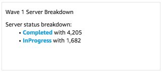
You can also customize the data by breaking down the metadata into waves. For example:
Example wave 1 server breakdown
(Optional) View Insights on the Amazon QuickSight dashboard
Note
You can use the following procedure if you have an enterprise license for Amazon QuickSight.
Use the following steps to add an insight to your dashboard which shows a breakdown of completed and in progress migrations.
-
In the top navigation pane, choose Insights.
-
On the Insights page, in the Count of Records BY MIGRATIONSTATUSSUMMARY section, hover over Top 2 MigrationSummarys item and choose the \+ to add an insight to the visual.
Add an insight to a visual

-
Customize the insight for your analysis by choosing Customize Narrative on the visual.
Add an Insight to your dashboard

Customize narrative option

-
Edit the narrative to fit your use case and choose Save. For example:
Edit your narrative

Return to the dashboard and filter it to show each wave:
-
On the left menu pane, choose Filter.
-
Choose the + button and select wave_id.
-
Select a wave to visualize and choose Apply.
-
To visualize all the migration waves, duplicate the visuals by choosing the ellipsis to the left side of the visual and selecting Duplicate visual.
Visualize the migration waves

-
Modify the filter for each visual to show a breakdown for each migration wave.
This insight is customized summarize the total count of servers across all waves. For more information and guide on how to customize insights, refer to Working with Insights in the QuickSight User Guide. You can access this QuickSight dashboard from any device and seamlessly embed it into your applications, portals, and websites. For more information about QuickSight dashboards, refer to Working with Dashboards in the Amazon QuickSight User Guide.
