Visualizations available in Grafana version 10
This documentation topic is designed for Grafana workspaces that support Grafana version 10.x.
For Grafana workspaces that support Grafana version 9.x, see Working in Grafana version 9.
For Grafana workspaces that support Grafana version 8.x, see Working in Grafana version 8.
Grafana offers a variety of visualizations to support different use cases. This section of the documentation highlights the built-in visualizations, their options and typical usage.
A common panel to get started with, and to learn the basics of using panels, is the Time series panel.
Note
If you are unsure which visualization to pick, Grafana can provide visualization suggestions based on the panel query. When you select a visualization, Grafana will show a preview with that visualization applied.
-
Graphs & charts
-
Time series is the default and main Graph visualization.
-
State timeline for state changes over time.
-
Status history for periodic state over time.
-
Bar chart shows any categorical data.
-
Histogram calculates and shows value distribution in a bar chart.
-
Heatmap visualizes data in two dimensions, used typically for the magnitude of a phenomenon.
-
Pie chart is typically used where proportionality is important.
-
Candlestick is typically for financial data where the focus is price/data movement.
-
Gauge is the traditional rounded visual showing how far a single metric is from a threshold.
-
Trend for datasets that have a sequential, numeric x that is not time.
-
XY Chart provides a way to visualize arbitrary x and y values in a graph.
-
-
Stats & numbers
-
Misc
-
Table is the main and only table visualization.
-
Logs is the main visualization for logs.
-
Node graph for directed graphs or networks.
-
Traces is the main visualization for traces.
-
Flame graph is the main visualization for profiling.
-
Geomap helps you visualize geospatial data.
-
Datagrid allows you to create and manipulate data, and acts as a data source for other panels.
-
-
Widgets
-
Dashboard list can list dashboards.
-
Alert list can list alerts.
-
Text can show markdown and html.
-
News can show RSS feeds.
-
Get more
You can add more visualization types by installing panel plugins from the Find plugins with the plugin catalog.
Examples
In the following sections you can find visualizations examples.
Graphs
For time based line, area, and bar charts, we recommend the default time series visualization.

For categorical data, use a bar chart.

Big numbers & stats
A stat visualization shows one large stat value with an optional graph sparkline. You can control the background or value color using thresholds or color scales.

Gauge
If you want to present a value as it relates to a min and max value, you have two options. First a standard radial gauge:

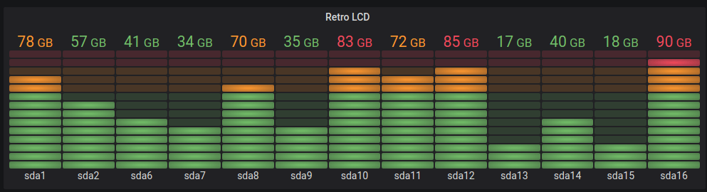
Secondly, Grafana also has a horizontal or vertical bar gauge with three distinct display modes.
Table
To show data in a table layout, use a table visualization.

Pie chart
To display reduced series, or values in a series, from one or more queries, as they relate to each other, use a pie chart visualization.

Heatmaps
To show value distribution over time, use a heatmap visualization.

State timeline
A state timeline shows discrete state changes over time. When used with time series, thresholds are used to turn numerical values into discrete state regions.

