Learn about responsive web design
Responsive web design is, among other things, a solution to the rapidly increasing demand for websites that look good across a range of display sizes. A few years ago, web designers only had to think about desktop monitors and—perhaps as an afterthought—smart phones. Now designers can count on site visits from mobile, tablet, netbook, laptop, and desktop clients in many different resolutions and aspect ratios. There's device orientation to think about, too, and the size of the browser window (not all users maximize it). With all of these variables, creating targeted content for every popular device is an unwieldy proposition, and one that's unlikely to scale well as device types continue to proliferate.
Fortunately, Ethan Marcotte has pointed to an alternative in his seminal article Responsive Web Design
Here's the TIME.com site at desktop scale.

And here's the site with the browser window reduced in size, as it would be on a mobile device.

The site adapts to the changing width of the browser window, moving content and transforming the navigation bar to a pop-out Sections menu.
Responsive web design makes life easier for web designers, who don't have to create a custom layout for every new device on the market. But it's ultimately about creating a better experience for the user, who no longer has to constantly resize, pan across, or otherwise adjust the viewport. In a good responsive design, the layout adapts to the size of the viewport while maintaining the intended proportionality among the various design elements.
Content, too, can be optimized for users. By thinking in terms of a content hierarchy, you can ensure that users easily find what they're looking for on any device. For example, at a certain pixel width, you might decide to collapse some content in order to make other content more discoverable.
Of course, in some cases, it may be better to have a separate mobile site, instead of a responsive site. For example, if you want to divide each of your desktop pages into multiple mobile pages, a single set of responsively designed pages is probably not going to be the best solution. But if you design with the "mobile first" axiom in mind, you may not need to restrict the content available to mobile users.
How Does Responsive Web Design Work?
Implementing a responsive design involves a combination of web development techniques and technologies. The following can all be part of a responsive design:
- Media Queries
-
Media Queries provide a way to conditionally apply CSS rules. The attributes
min-widthandmax-widthare especially useful, because they let you apply styles according to the minimum or maximum width of the viewport. For example, the following query sets styles for a viewport of 600 to 1000 pixels wide:@media screen and (min-width: 600px) and (max-width: 1000px) { … }You can also set
device-widthandorientationin media queries. Using the logical operatorsand,not, andonly, you can combine media queries for more finely tuned styling.The conditional logic of a media query can be applied in several ways. You can embed a media query in a link to a style sheet, so that the style sheet is applied to the markup only if the indicated conditions are met. You can use a media query within an
@importrule, which imports styles from other style sheets. And you can put media queries directly into a style sheet, as we've done in the Silk examples below. - Fluid Layout
-
A fluid layout (also referred to as a fluid grid or liquid layout) keeps individual elements of the web page proportional across various display sizes. Conceptually, the opposite of a fluid layout would be a fixed-width layout in which the sizes of various elements are specified in pixels. The key to creating a fluid layout is to use relative rather than absolute values. A value of 80% can scale proportionally; a value of 600 pixels can't. To create a fluid layout, think percentages and ems (one em is equal to the current font size), not pixels.
To calculate the proportional size of layout elements (text or containers, measured in ems or percentages), use the following formula: target / context = result. For example, given a main content area of 800 pixels (the context), divided into a left column of 500 pixels (the target) and a right column of 300 pixels, you set the left column to 62.5% of the main content area (500 / 800 = 0.625).
As you consider the technical aspects of creating a fluid layout, you'll probably also want to give some thought to your content hierarchy. Using a fluid layout and breakpoints, you can reorder content containers as the viewport changes size. There's no one right way to design a fluid layout, but it's a good idea to make important content easy to find.
- Context-Aware Images
-
Context-aware images, or flexible images, are an important part of a fluid layout. The idea is pretty simple. An image with absolute width and height can't scale with a fluid grid. But an image with its
max-widthproperty set to 100% can scale down for smaller viewports. To save bandwidth, you can also serve different images according to screen resolution. That way you don't force the client to load a larger image than necessary. Theoverflow:hiddenproperty can also help size images appropriately, by cropping them. Keep in mind that enlarging an image beyond its original dimensions can result in perceptible loss of quality. - Viewport Meta Element
-
The viewport is the area within which the browser draws a page, excluding the browser Chrome. You can use the viewport Meta Element to ensure that the viewport width is the same as the screen width. This is important for mobile devices, because mobile browsers often try to render an entire desktop-scale page within a mobile viewport. While this zoomed-out view lets the user see the full page without swiping, it also effectively miniaturizes content. Moreover, media queries may not work as expected if the viewport tag isn't implemented properly.
To avoid problems, include the
viewportmeta element in theheadsection of your HTML document, and setwidthtodevice-width:<meta name="viewport" content="width=device-width">This setting prevents browsers from zooming out to fit more pixels in the viewport. The pixel width available to the viewport will be the same as the pixel width of the device screen.
- Breakpoints
-
A breakpoint represents a particular viewport width at which the layout changes. A breakpoint occurs when the styling specified by one media query gives way to the styling of another media query. In this sense, a breakpoint is not so much a single line of code as it is a design abstraction. One strategy for creating breakpoints is to target common device widths so that your layout is optimized for specific devices.
Another strategy (arguably a better one) is to create breakpoints based on your content, and not on device constraints. Designing breakpoints around content aims to make the layout user friendly and aesthetically pleasing across a range of possible viewport widths. With this approach, you can minimize awkward layouts that fall between device widths, and you don't have to plan for as many one-off scenarios (tablet "X" in portrait, tablet "Y" in landscape, and so on). After all, the best outcome is to have content that looks great at any display size.
Responsive Design and Amazon Silk
Let's see how Silk renders a responsive design template.
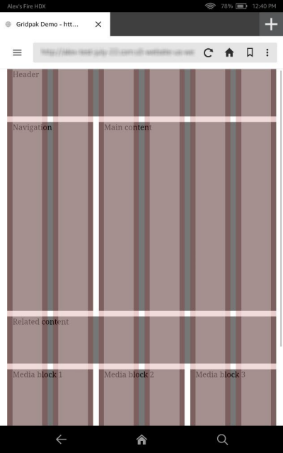
We'll use the Gridpak app
Here's our demo site in portrait view on a Fire HD 8.9" tablet:
The following media query and the associated styles and scripts (which aren't shown) produce a 6-column grid when the viewport is between 320 and 800 pixels wide.:
@media screen and (min-width: 320px) and (max-width: 800px) {
/* styles for 6-column grid */
}
Now here's our demo site in landscape view:

In this case, the following media query, plus the omitted styles and scripts, produce a 12-column grid when the viewport is more than 800 pixels wide.
@media screen and (min-width: 801px) {
/* styles for 12-column grid */
}
We haven't had to reference device orientation in our media queries. We just specify width ranges. To make this layout work correctly on Silk, we also need to add a viewport meta tag to our HTML:
<meta name="viewport" content="width=device-width">
Here we've made width equal to
device-width. This enables Silk to respond as expected to changes of device
orientation. We could also configure the viewport scale using maximum-scale,
initial-scale, and user-scalable. For example, the following
configuration loads the site at the scale of the viewport and lets the user zoom in to triple
the scale of the viewport:
<meta name="viewport" content="width=device-width, initial-scale=1.0, maximum-scale=3.0">
A minimum-scale setting is also available, but
with width set to device-width, the user won't be able to zoom out
past the width of the device.
The Takeaway
So what's the takeaway for you, the site owner or web designer? Well, it's pretty simple. You don't need to develop separate content for Silk. Of course, we recommend that you test your site on a variety of devices. But with responsive web design, you don't have to implement a new design tactic for every device on the market. Instead, you can focus on developing content that looks great on any device. Silk users will benefit from your efforts, and so will all the rest of your customers.
Additional Resources
-
Targeting Screens from Web Apps
in the Android Developers Guide -
Ethan Marcotte, Responsive Web Design
in A List Apart -
Grace Smith, 85 Top Responsive Web Design Tools
in Mashable -
Rahul Lalmalani's series on responsive web design in MSDN Magazine:
-
Katrien De Graeve, Responsive Web Design
in MSDN Magazine -
Responsive Web design
in the Mozilla Developer Network -
Rudy Rigot and Sophie Taboni, Responsive web design: a project-management perspective
at Dev.Opera -
Chris Mills, Love your devices: adaptive web design with media queries, viewport and more
at Dev.Opera -
Andreas Bovens, An introduction to meta viewport and @viewport
at Dev.Opera -
Examples of responsively designed sites in Media Queries
