How Amazon QuickSight works - Amazon QuickSight

Important: We've redesigned the Amazon QuickSight analysis workspace. You might encounter screenshots or procedural text that doesn't reflect the new look in the QuickSight console. We're in the process of updating screenshots and procedural text.

To find a feature or item, use the Quick search bar.

For more information on QuickSight's new look, see Introducing new analysis experience on Amazon QuickSight.

How Amazon QuickSight works

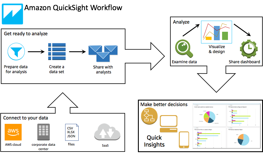
Using Amazon QuickSight, you can access data and prepare it for use in reporting. It saves your prepared data either in SPICE memory or as a direct query. You can use a variety of data sources for analysis. When you create an analysis, the typical workflow looks like this:

  1. Create a new analysis.

  2. Add new or existing datasets.

  3. Choose fields to create the first chart. QuickSight automatically suggests the best visualization.

  4. Add more charts, tables, or insights to the analysis. Resize and rearrange them on one or more sheets. Use extended features to add variables, custom controls, colors, additional pages (called sheets), and more.

  5. Publish the analysis as a dashboard to share it with other people.

The following illustration shows the basic workflow.

Terminology

Data preparation is the process of transforming data for use in an analysis. This includes making changes like the following:

  • Filtering out data so that you can focus on what's important to you.

  • Renaming fields to make them easier to read.

  • Changing data types so that they are more useful.

  • Adding calculated fields to enhance analysis.

  • Creating SQL queries to refine data.

SPICE (Super-fast, Parallel, In-memory Calculation Engine) is the robust in-memory engine that QuickSight uses. SPICE is engineered to rapidly perform advanced calculations and serve data. The storage and processing capacity available in SPICE speeds up the analytical queries that you run against your imported data. By using SPICE, you save time because you don't need to retrieve the data every time that you change an analysis or update a visual.

A data analysis is the basic workspace for creating data visualizations, which are graphical representations of your data. Each analysis contains a collection of visualizations that you arrange and customize.

A data visualization, also known as a visual, is a graphical representation of data. There are many types of visualizations, including diagrams, charts, graphs, and tables. All visuals begin in AutoGraph mode, which automatically selects the best type of visualization for the fields that you select. You can also take control and choose your own visuals. You can enhance your analytics by applying filters, changing colors, adding parameter controls, custom click actions, and more.

Machine learning (ML) Insights propose narrative add-ons that are based on an evaluation of your data. You can choose one from the list, for example forecasting or anomaly (outlier) detection. Or you can create your own. You can combine insight calculations, narrative text, colors, images, and conditions that you define.

A sheet is a page that displays a set of visualizations and insights. You can imagine this as a sheet from a newspaper, except that it's filled with charts, graphs, tables, and insights. You can add more sheets, and make them work separately or together in your analysis.

A dashboard is the published version of an analysis. You can share with other users of Amazon QuickSight for reporting purposes. You specify who has access and what they can do with the dashboard.

Using sample data

To get a first look at how QuickSight works, you can explore Amazon QuickSight using the following sample data:

Also, a variety of datasets are available free online that you can use with Amazon QuickSight, for example the AWS public datasets. These datasets come in a variety of formats.