Debugger XGBoost training report walkthrough
This section walks you through the Debugger XGBoost training report. The report is automatically aggregated depending on the output tensor regex, recognizing what type of your training job is among binary classification, multiclass classification, and regression.
Important
In the report, plots and and recommendations are provided for informational purposes and are not definitive. You are responsible for making your own independent assessment of the information.
Topics
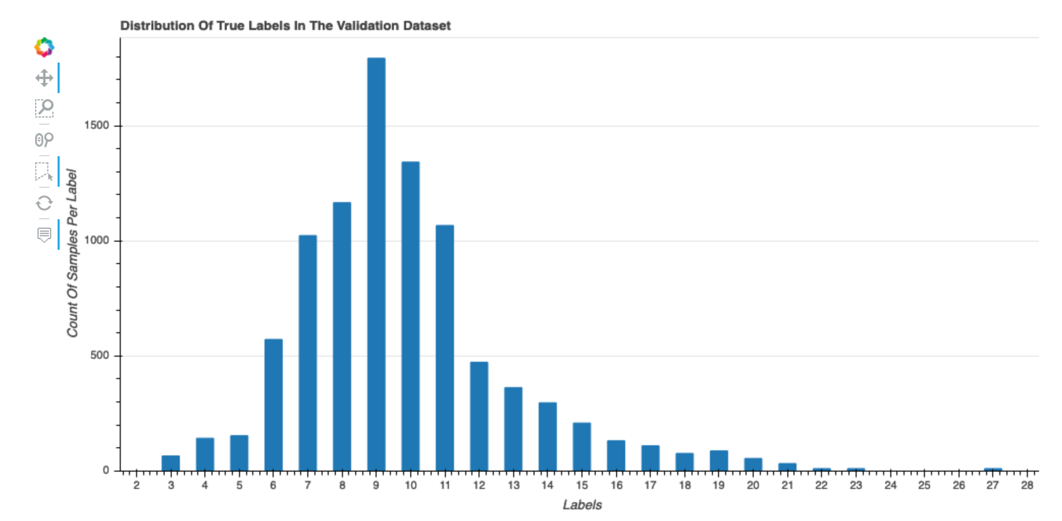
Distribution of true labels of the dataset
This histogram shows the distribution of labeled classes (for classification) or values (for regression) in your original dataset. Skewness in your dataset could contribute to inaccuracies. This visualization is available for the following model types: binary classification, multiclassification, and regression.
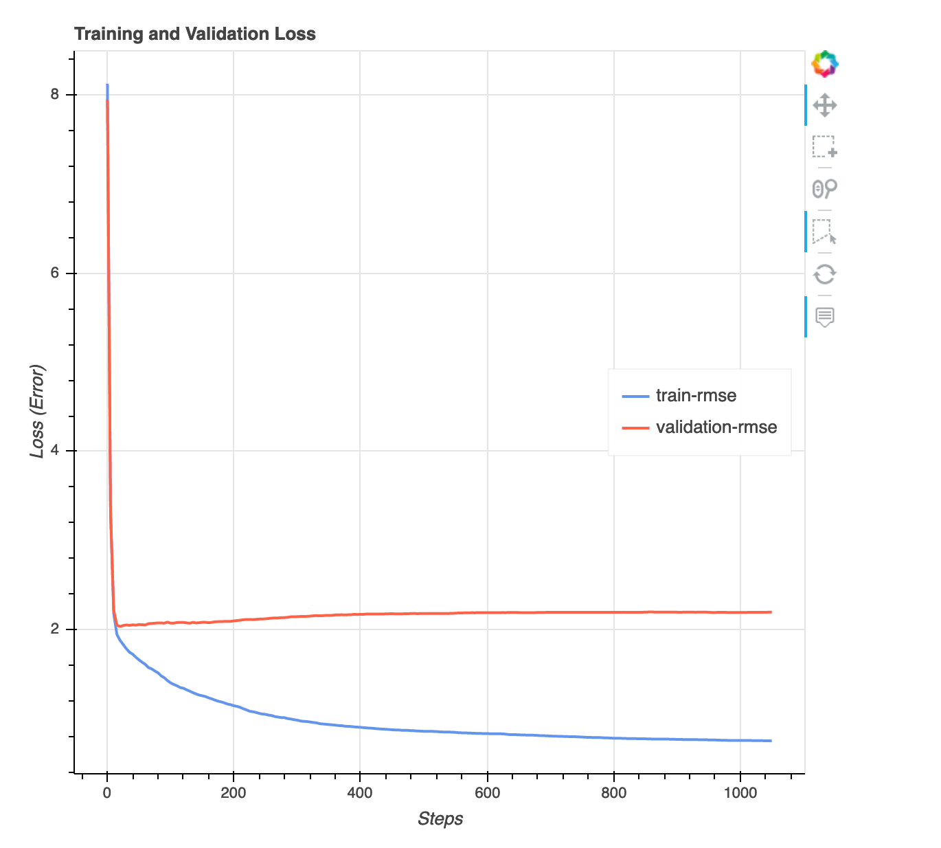
Loss versus step graph
This is a line chart that shows the progression of loss on training data and validation data throughout training steps. The loss is what you defined in your objective function, such as mean squared error. You can gauge whether the model is overfit or underfit from this plot. This section also provides insights that you can use to determine how to resolve the overfit and underfit problems. This visualization is available for the following model types: binary classification, multiclassification, and regression.
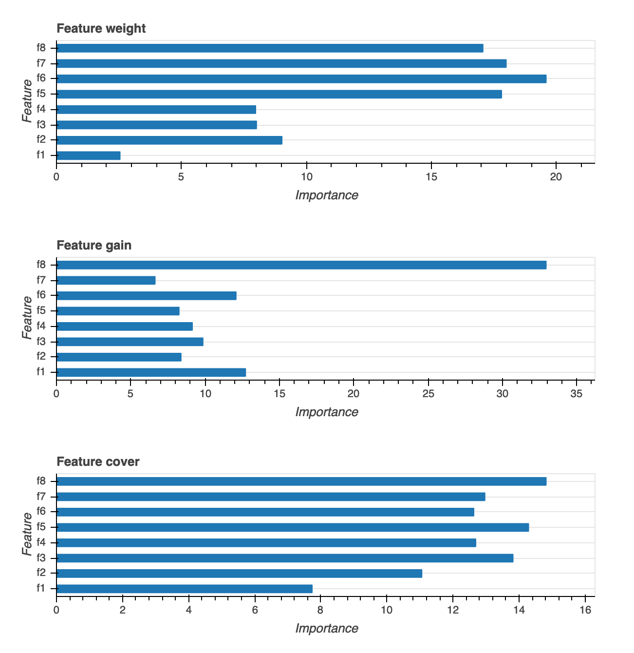
Feature importance
There are three different types of feature importance visualizations provided: Weight, Gain and Coverage. We provide detailed definitions for each of the three in the report. Feature importance visualizations help you learn what features in your training dataset contributed to the predictions. Feature importance visualizations are available for the following model types: binary classification, multiclassification, and regression.
Confusion matrix
This visualization is only applicable to binary and multiclass classification models. Accuracy alone might not be sufficient for evaluating the model performance. For some use cases, such as healthcare and fraud detection, it’s also important to know the false positive rate and false negative rate. A confusion matrix gives you the additional dimensions for evaluating your model performance.
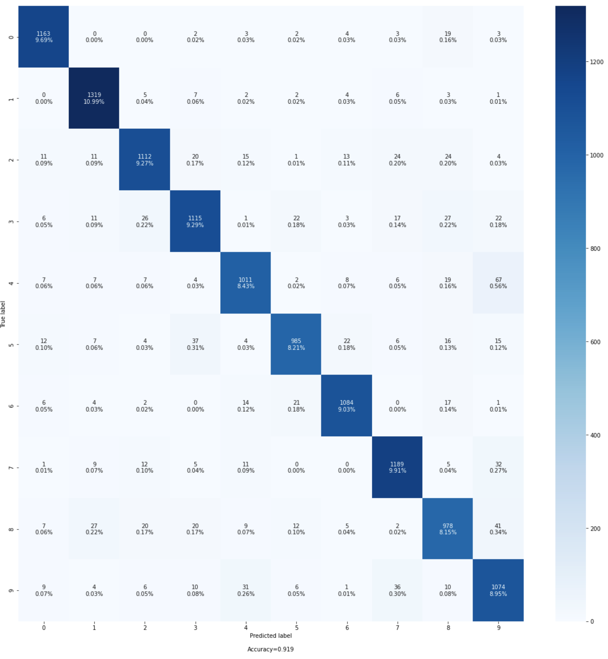
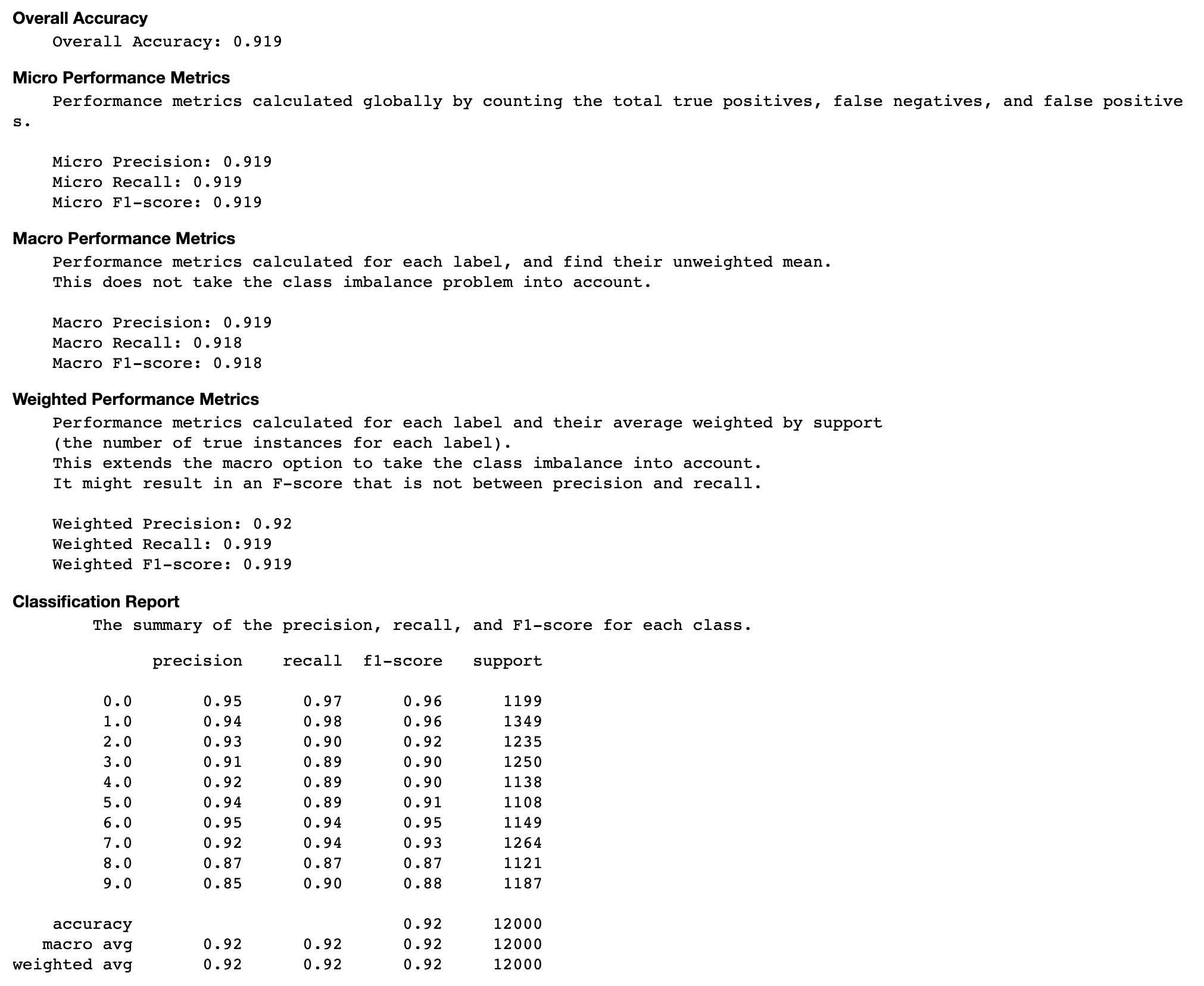
Evaluation of the confusion matrix
This section provides you with more insights on the micro, macro, and weighted metrics on precision, recall, and F1-score for your model.
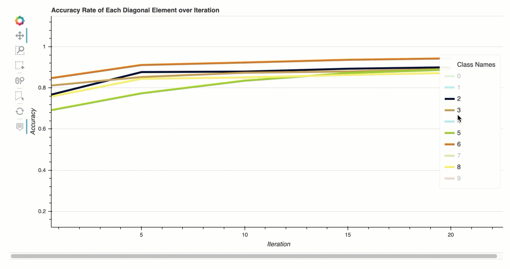
Accuracy rate of each diagonal element over iteration
This visualization is only applicable to binary classification and multiclass classification models. This is a line chart that plots the diagonal values in the confusion matrix throughout the training steps for each class. This plot shows you how the accuracy of each class progresses throughout the training steps. You can identify the under-performing classes from this plot.
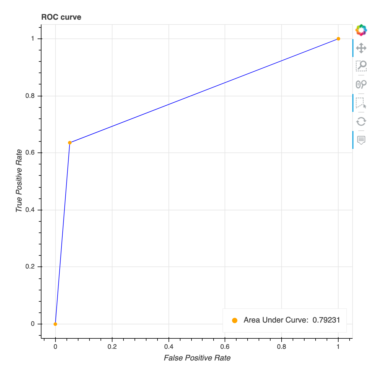
Receiver operating characteristic curve
This visualization is only applicable to binary classification models. The Receiver Operating Characteristic curve is commonly used to evaluate binary classification model performance. The y-axis of the curve is True Positive Rate (TPF) and x-axis is false positive rate (FPR). The plot also displays the value for the area under the curve (AUC). The higher the AUC value, the more predictive your classifier. You can also use the ROC curve to understand the trade-off between TPR and FPR and identify the optimum classification threshold for your use case. The classification threshold can be adjusted to tune the behavior of the model to reduce more of one or another type of error (FP/FN).
Distribution of residuals at the last saved step
This visualization is a column chart that shows the residual distributions in the last step Debugger captures. In this visualization, you can check whether the residual distribution is close to normal distribution that’s centered at zero. If the residuals are skewed, your features may not be sufficient for predicting the labels.

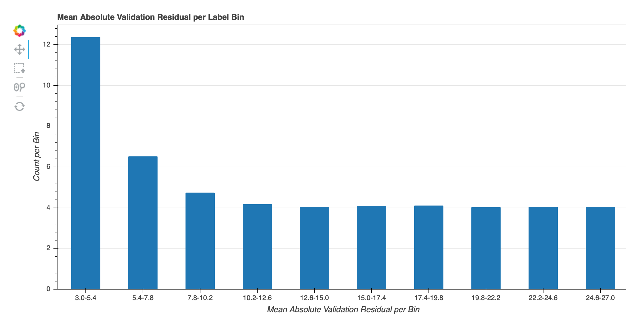
Absolute validation error per label bin over iteration
This visualization is only applicable to regression models. The actual target values are split into 10 intervals. This visualization shows how validation errors progress for each interval throughout the training steps in line plots. Absolute validation error is the absolute value of difference between prediction and actual during validation. You can identify the underperforming intervals from this visualization.